A Collection of Books
Graphic Design, Layout Design, Mock-Ups
❋ Eat With Care
Conceptualize and design a full project plan, brand identity and rollout for a large social campaign. The goal of this project was to create a unique look that helps exemplify the cause of my campaign and speak to the target audience in an engaging and comprehensive way. Eat with Care is a campaign set up to help young professionals who are starting to live and cook on their own, build environmentally friendly food purchasing habits by going to farmers markets and building relationships with local vendors.
When outlining my final campaign, I made sure to include a thorough and comprehensive strategy walking through the motivation and roll out of my brand. Once I decided on my target user, I worked through several iterations on how best to reach my audience in a friendly and supportive way.


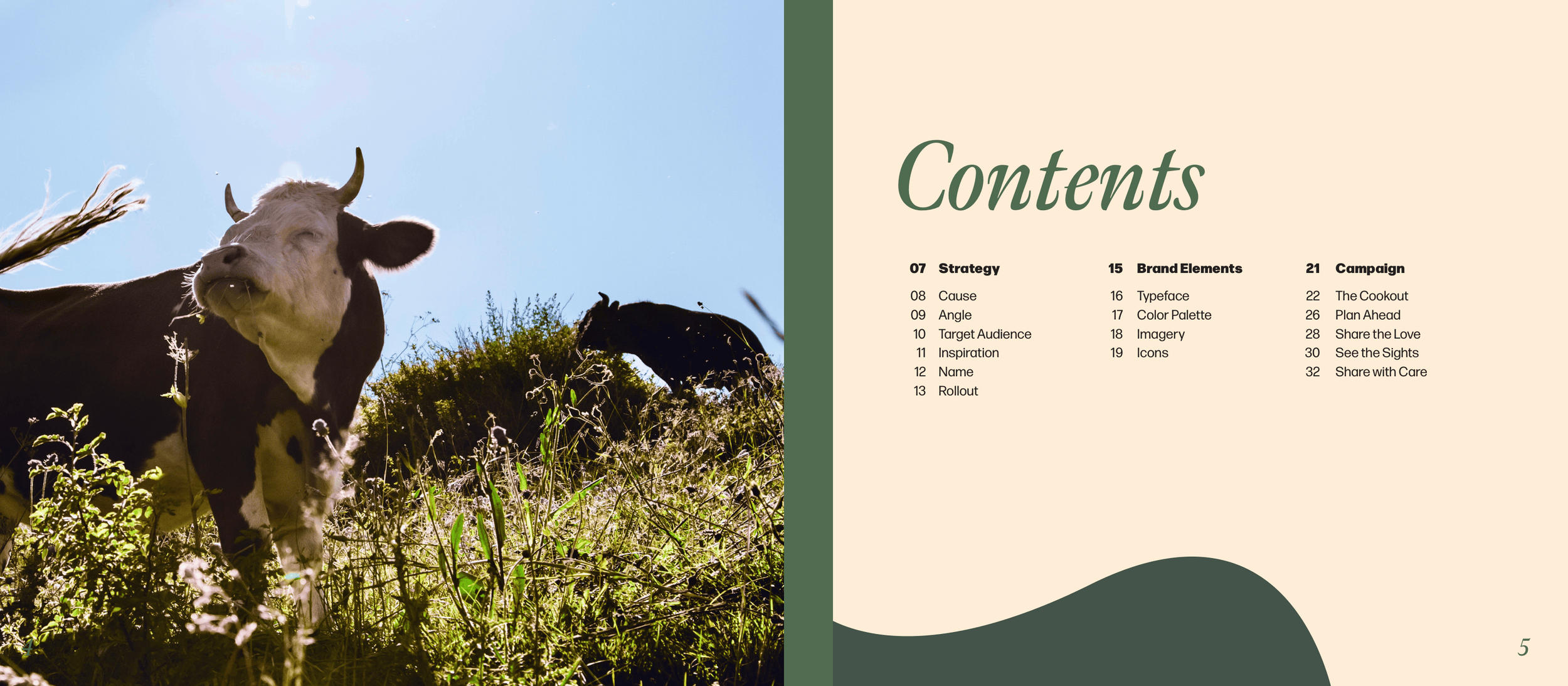
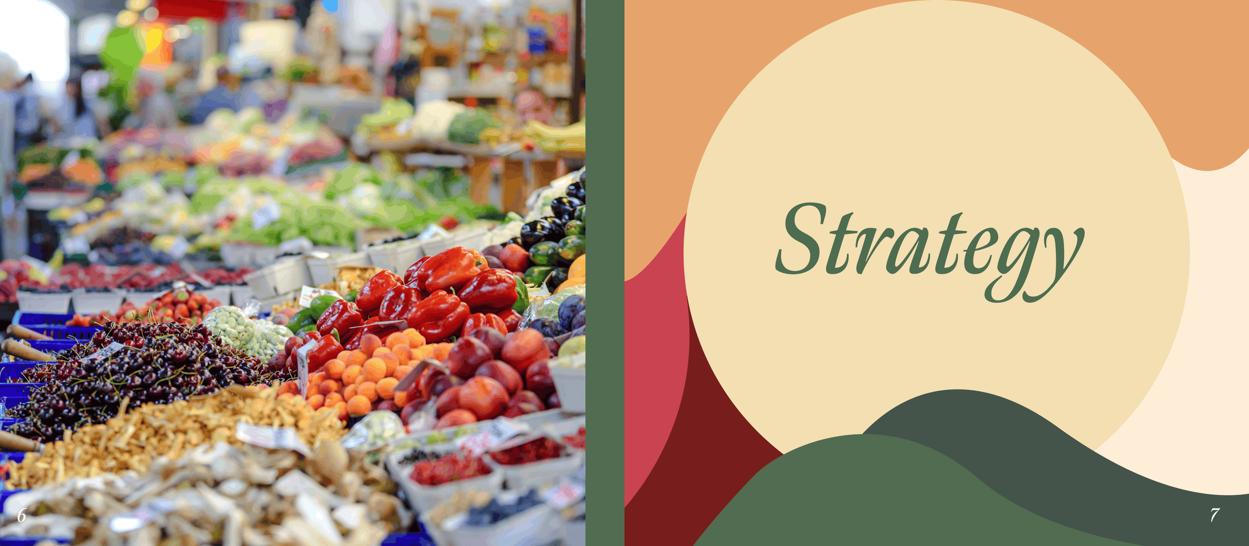
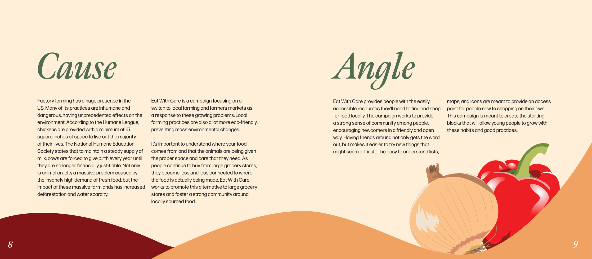
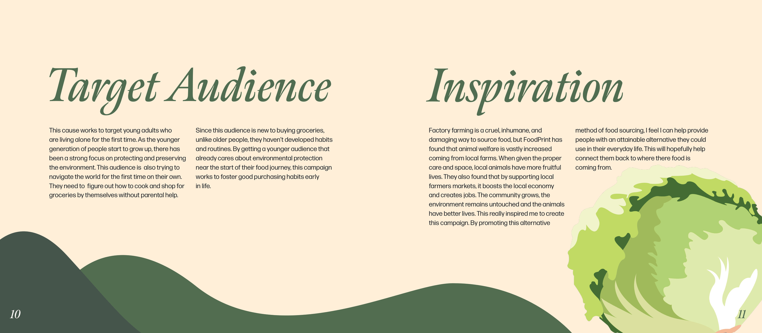
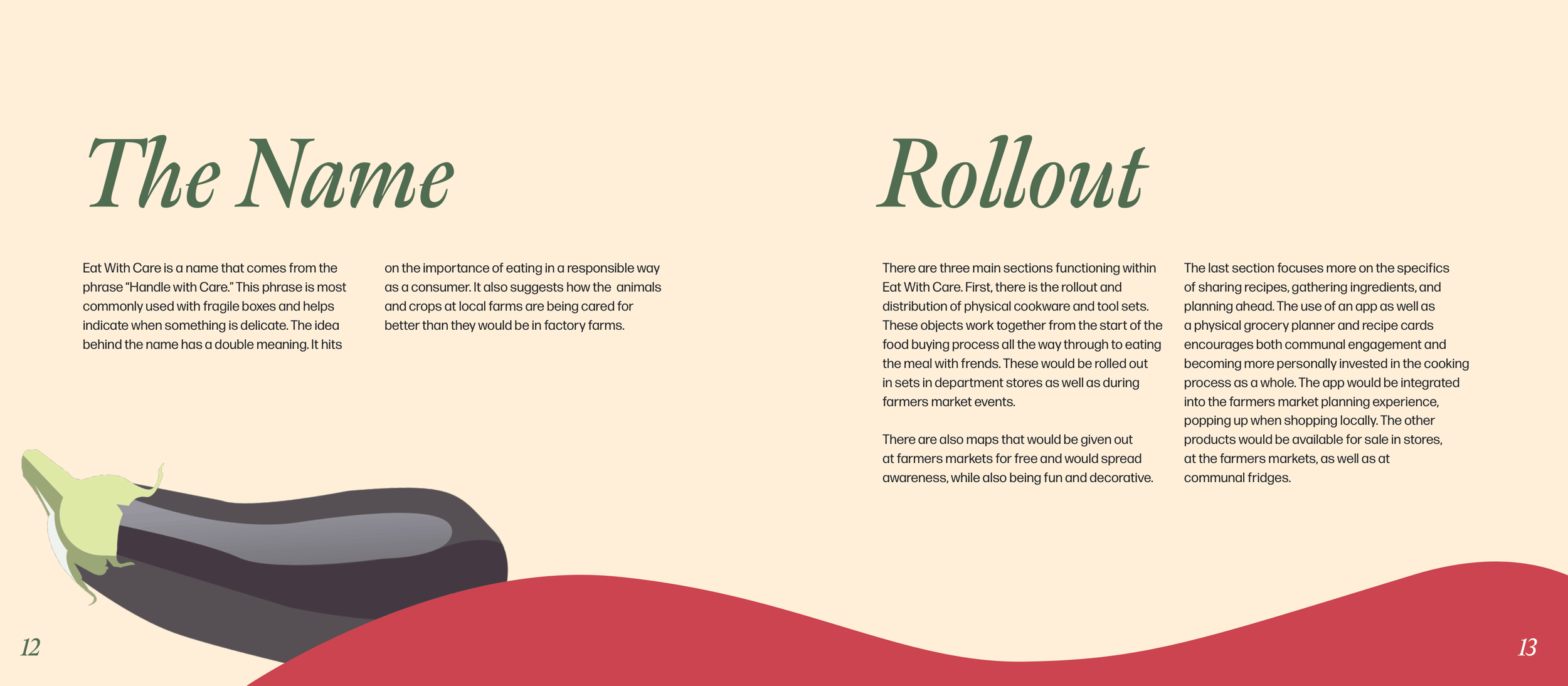
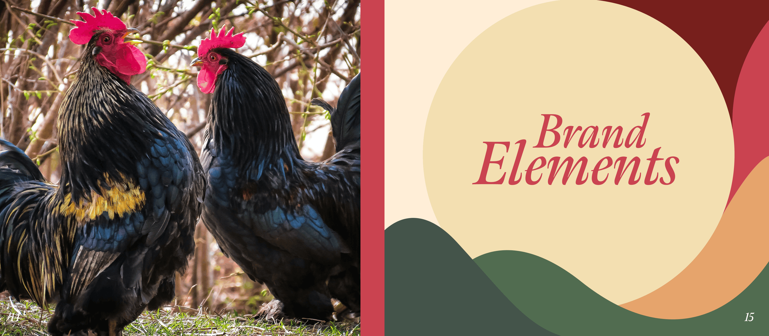
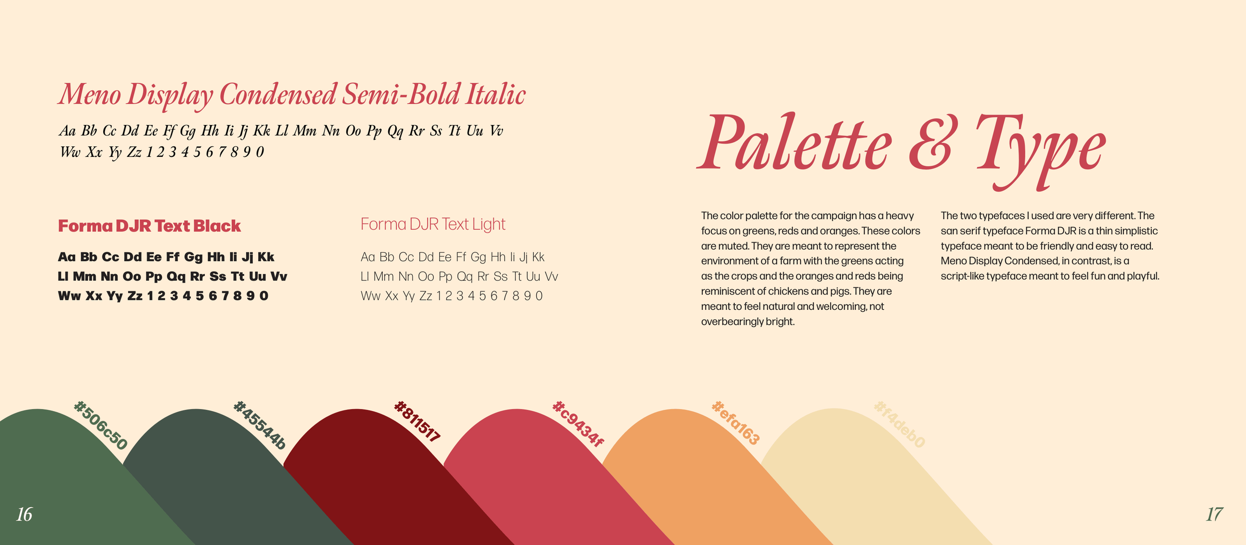
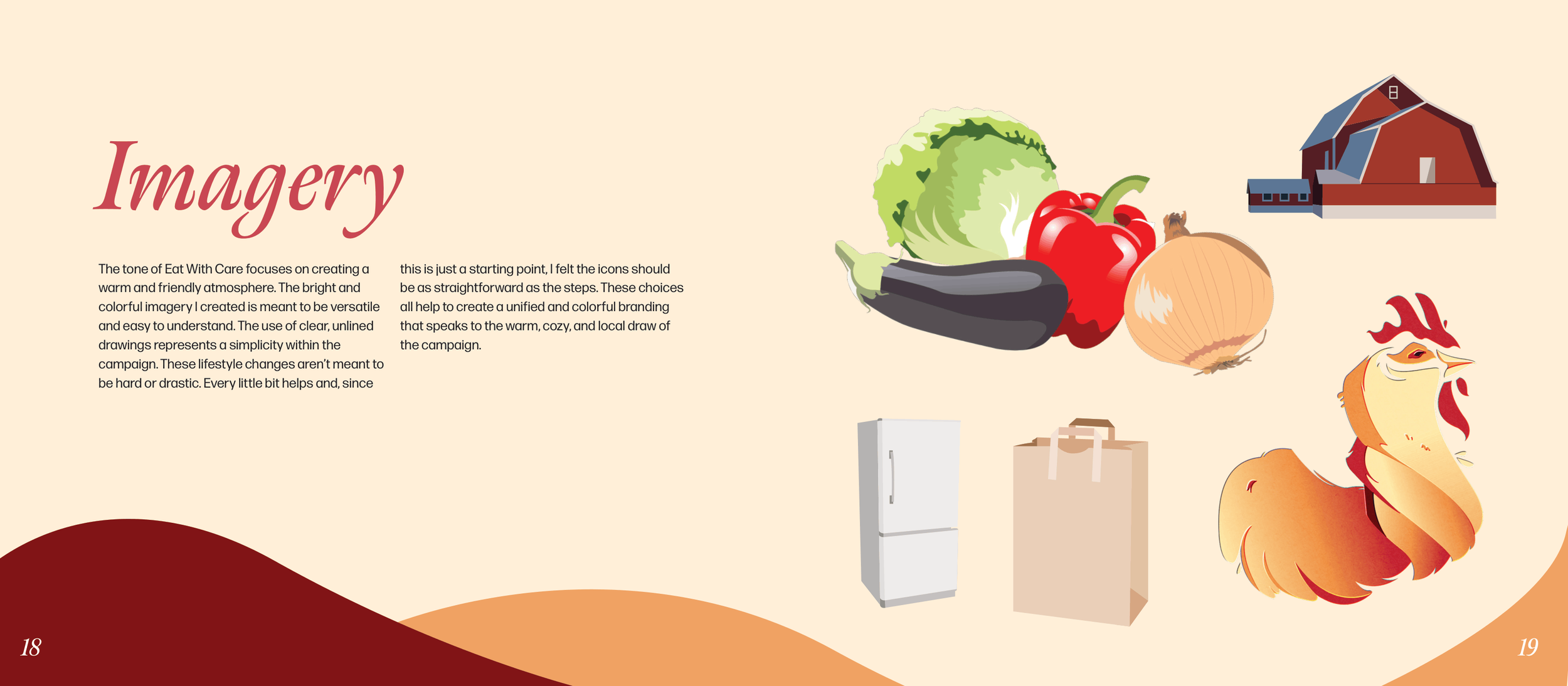
As the strategy evolved, so to did the visual brand identity. Displayed here are the final color palette, typography, and imagery used throughout the campaign.
Through weeks of meeting with classmates and collecting user feedback on how best to support a new grocery shopper, I settled on a series of products that address the journey from start to finish.
Building a strong community to help and support new buyers became a prevalent piece of insight during my user testing, which I worked to address in each product I created.
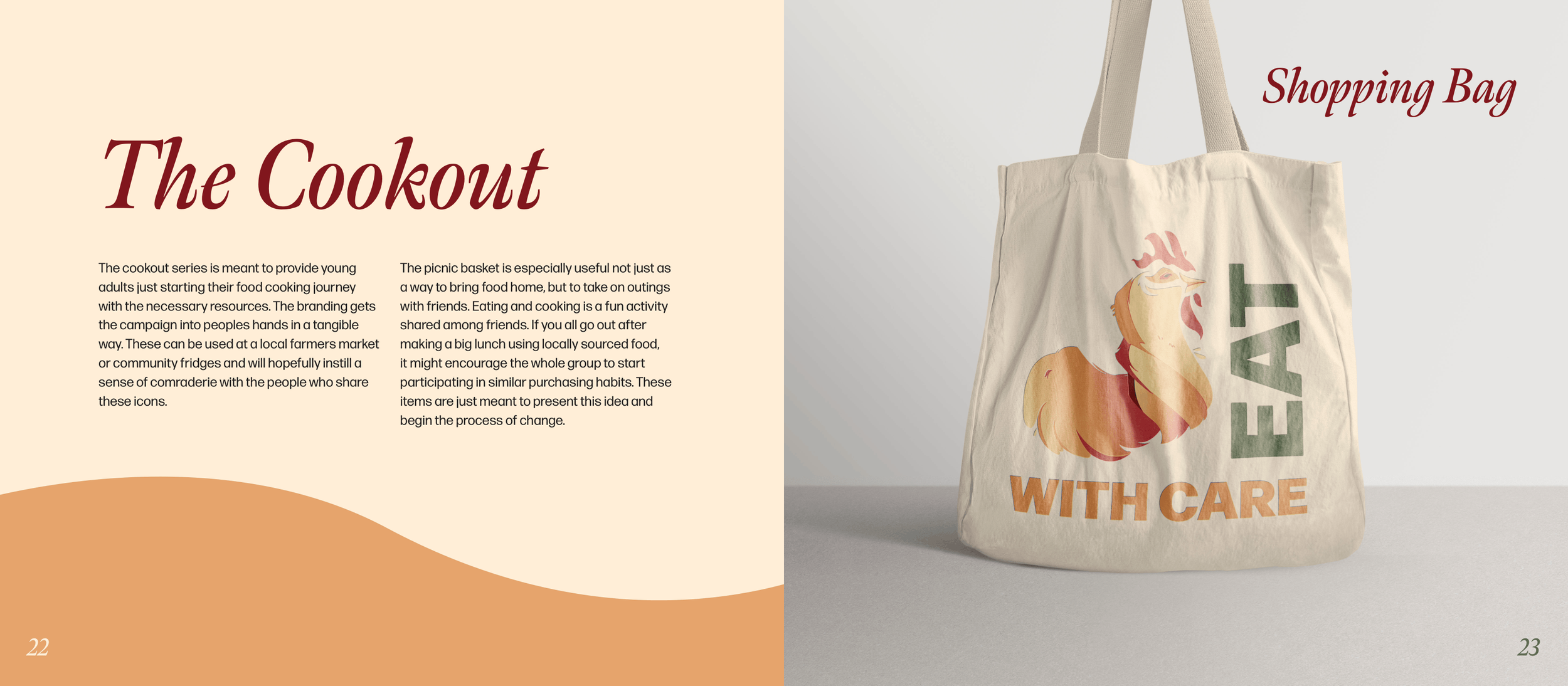
The cookout series outlines a user's journey to the store, to the kitchen, and then back out with your friends with additional resources for planning out your meals, finding local markets and sharing your recipes with others.
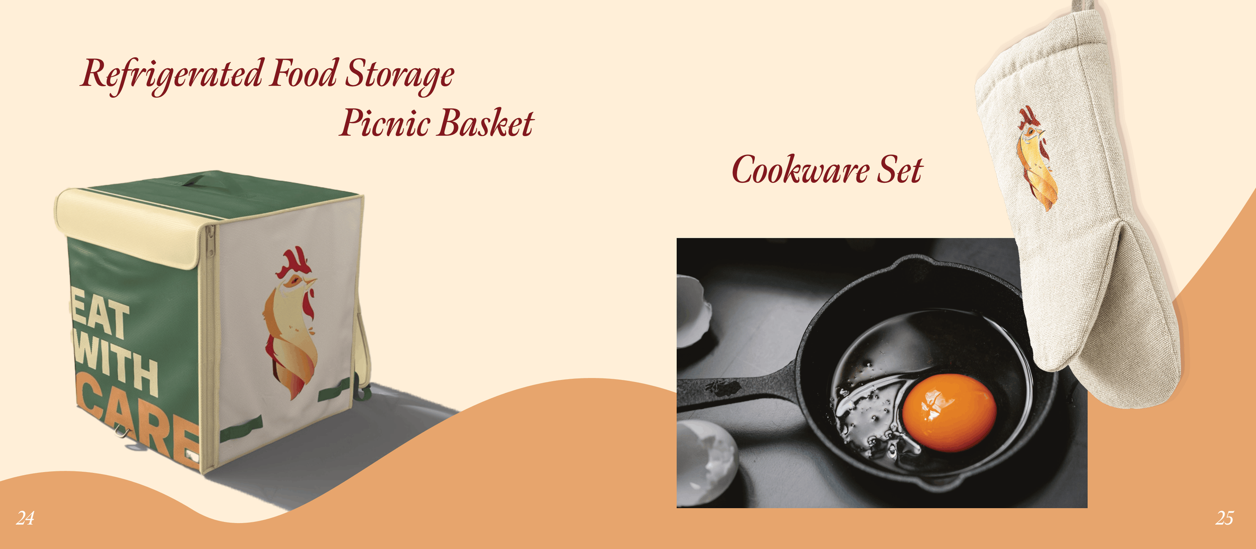
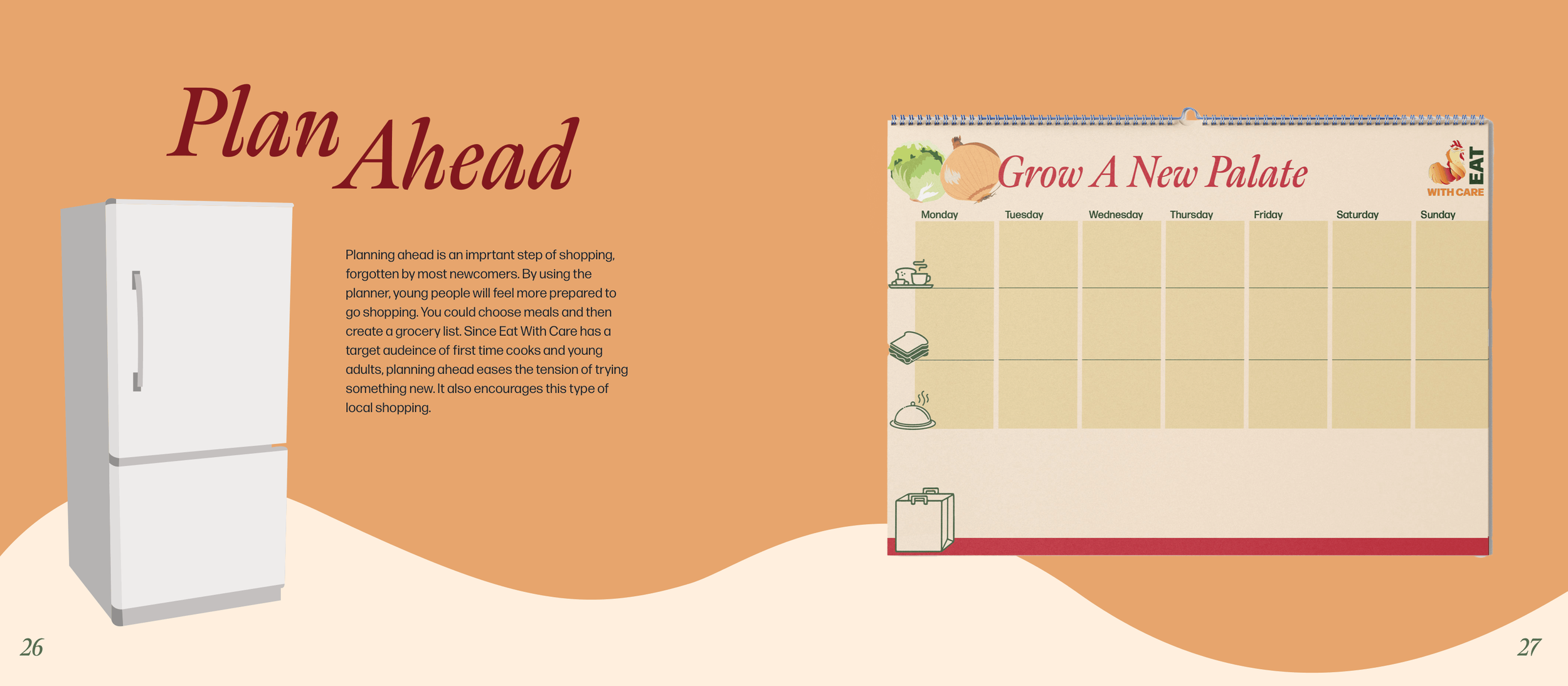
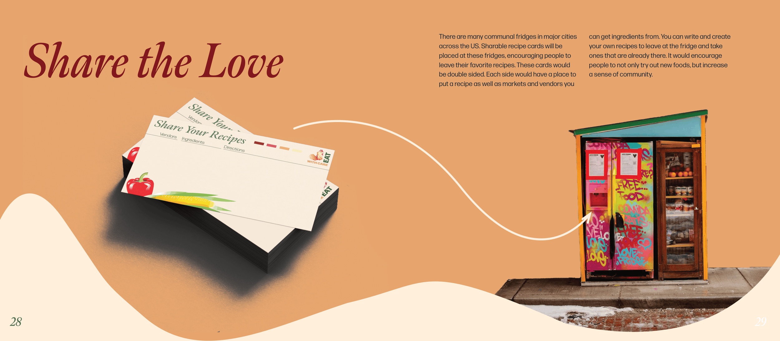
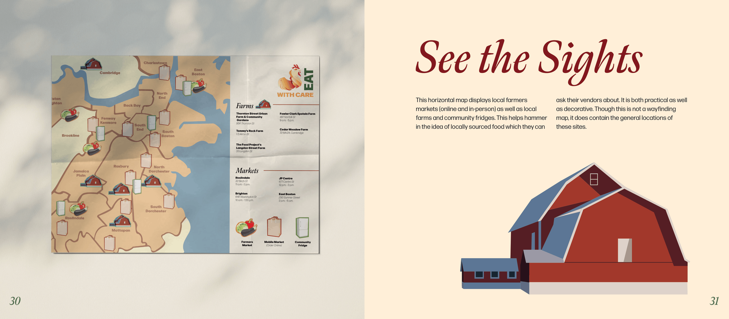
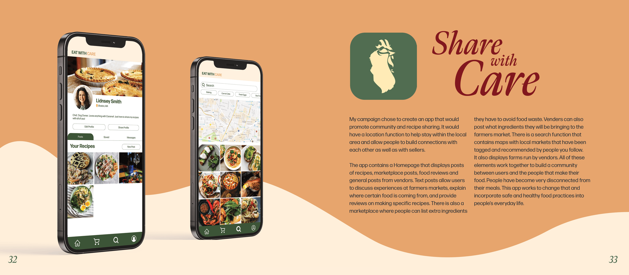
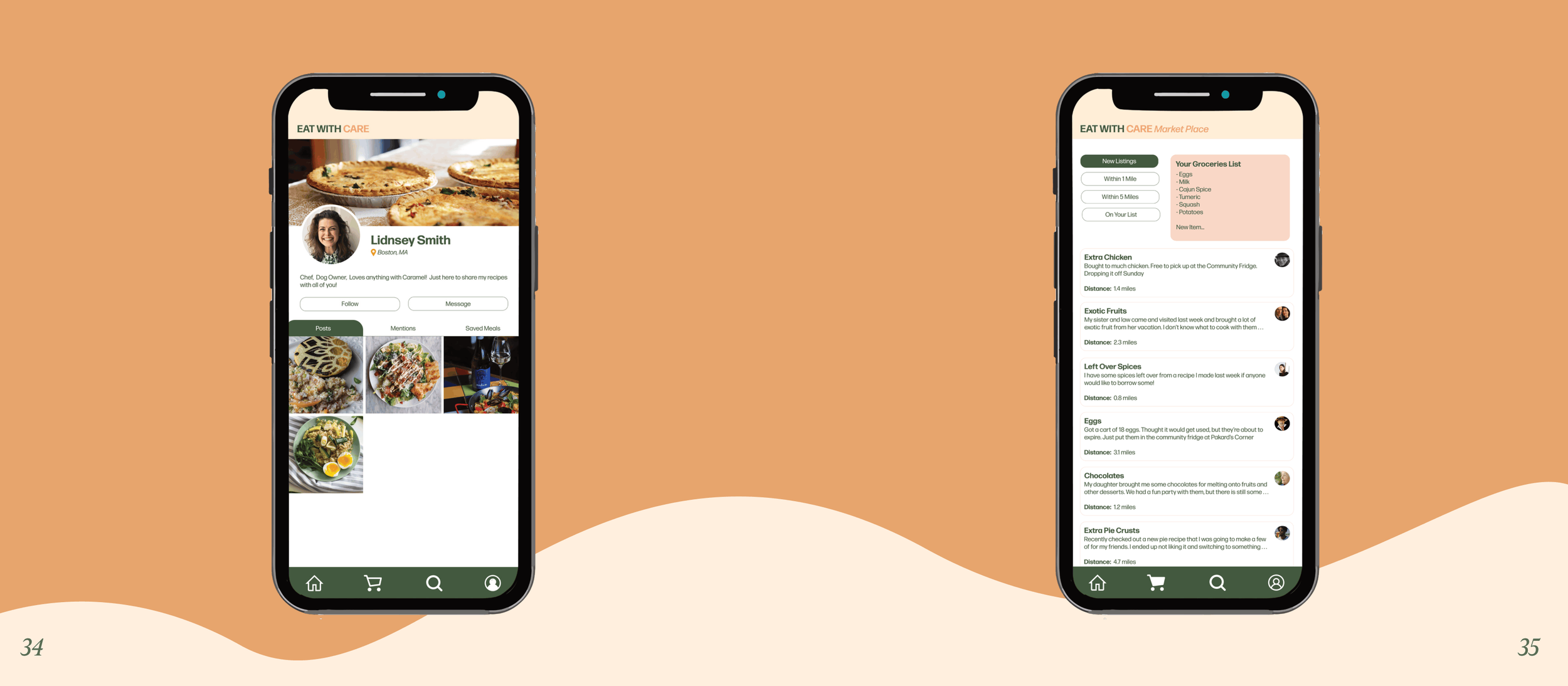
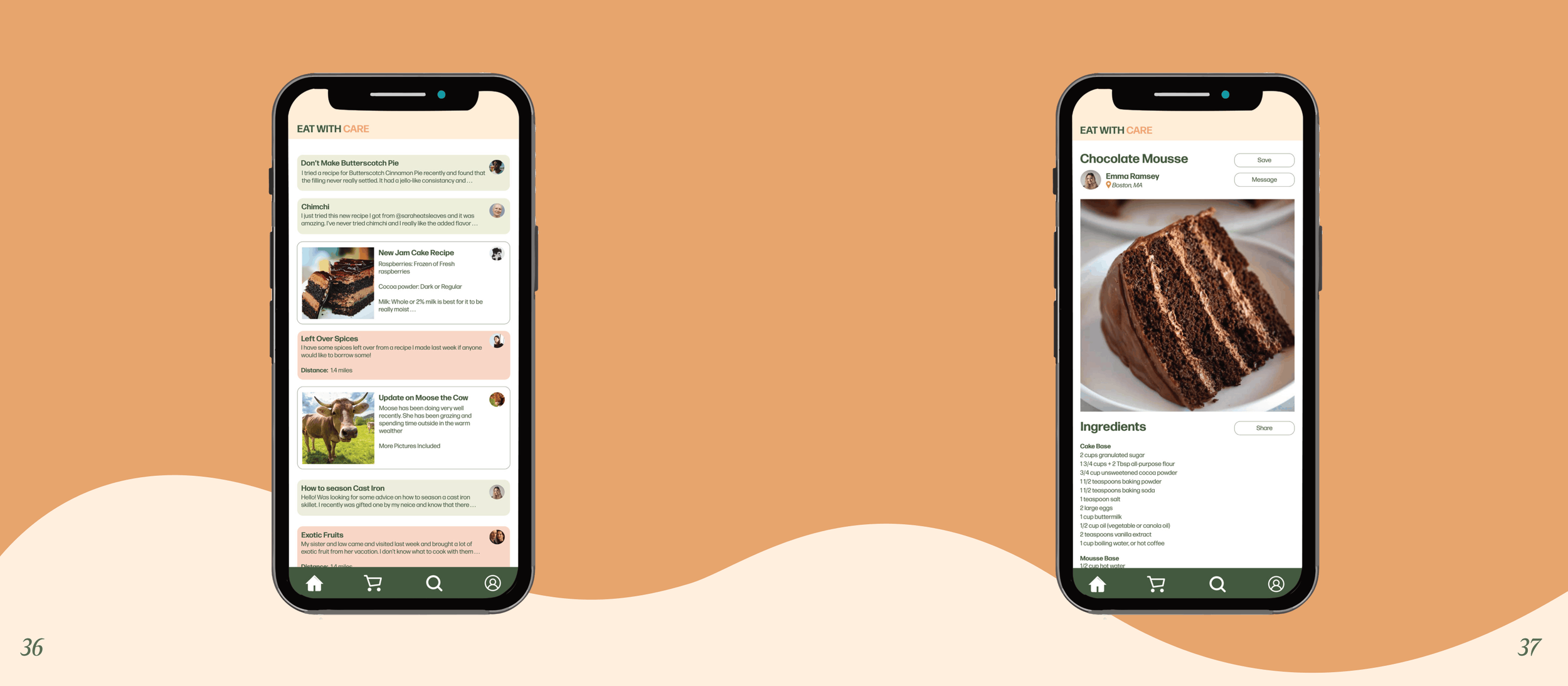
Lastly, I designed an app further building out the community space for users. This app allows sharing recipes, connecting with other local farmers market shoppers and developing a personal connection with the farms and farmers producing your food.
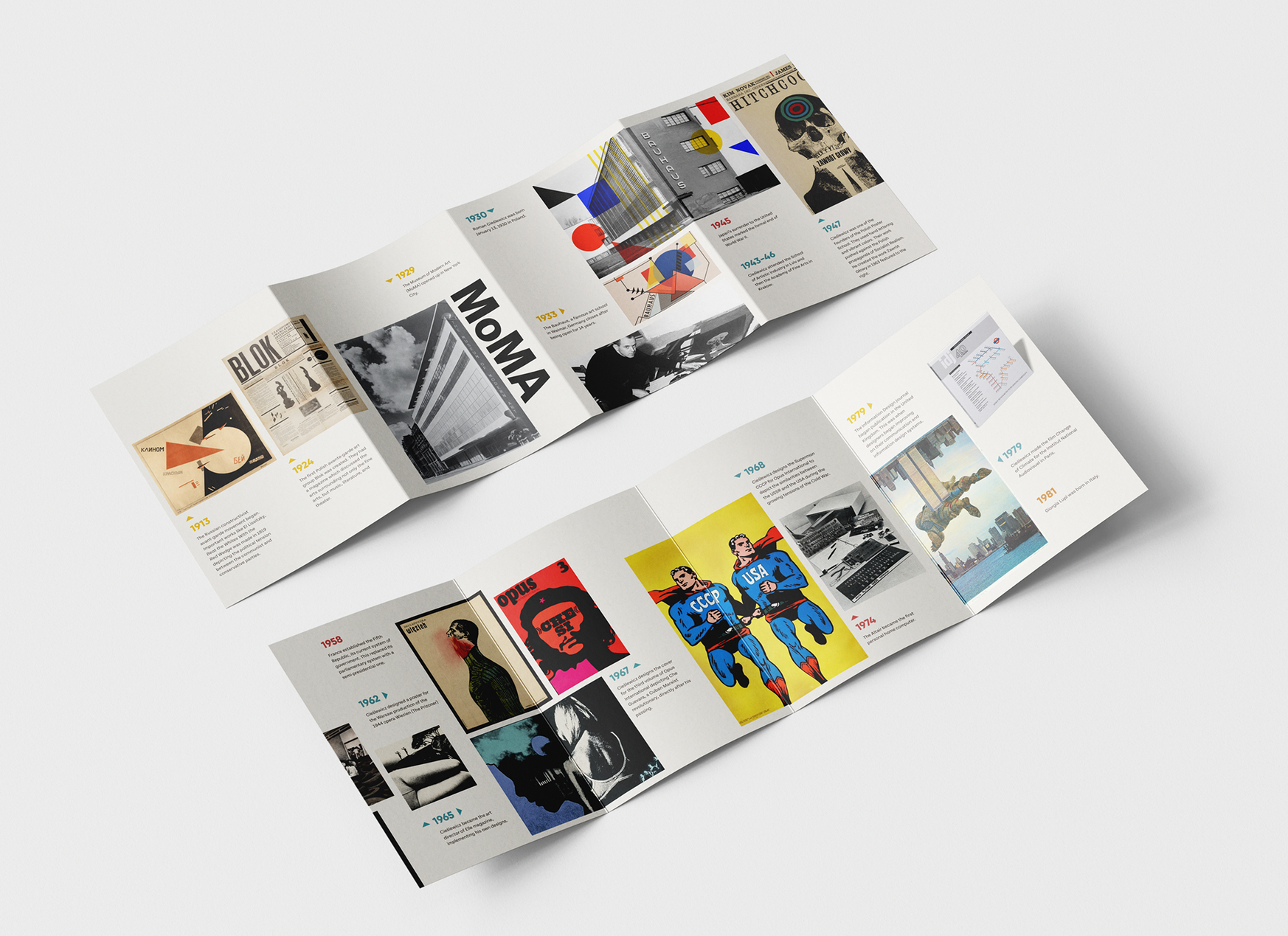
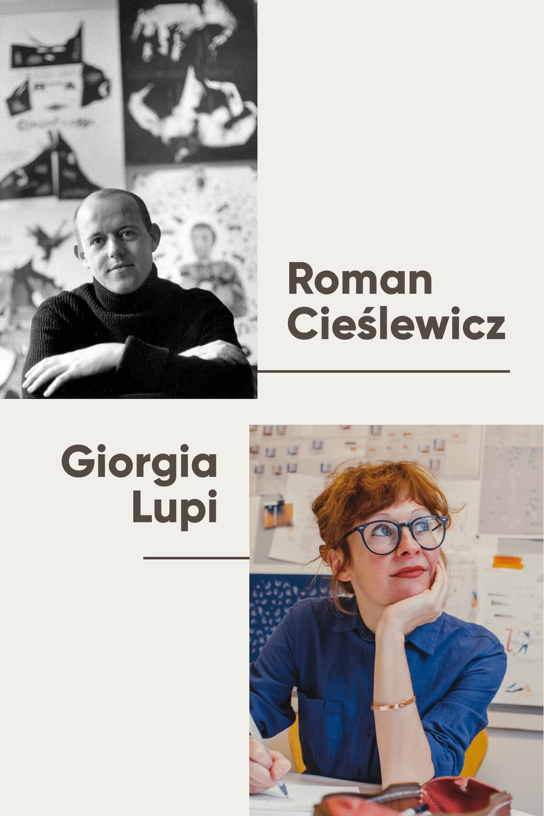
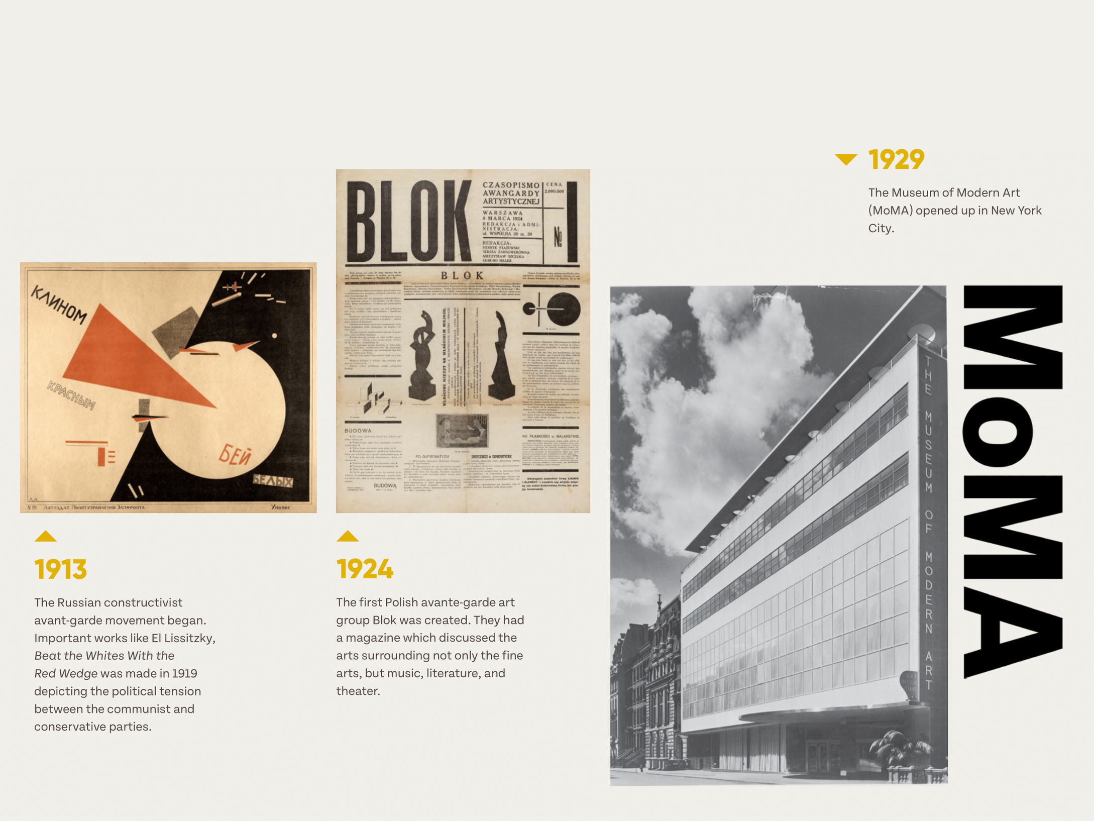
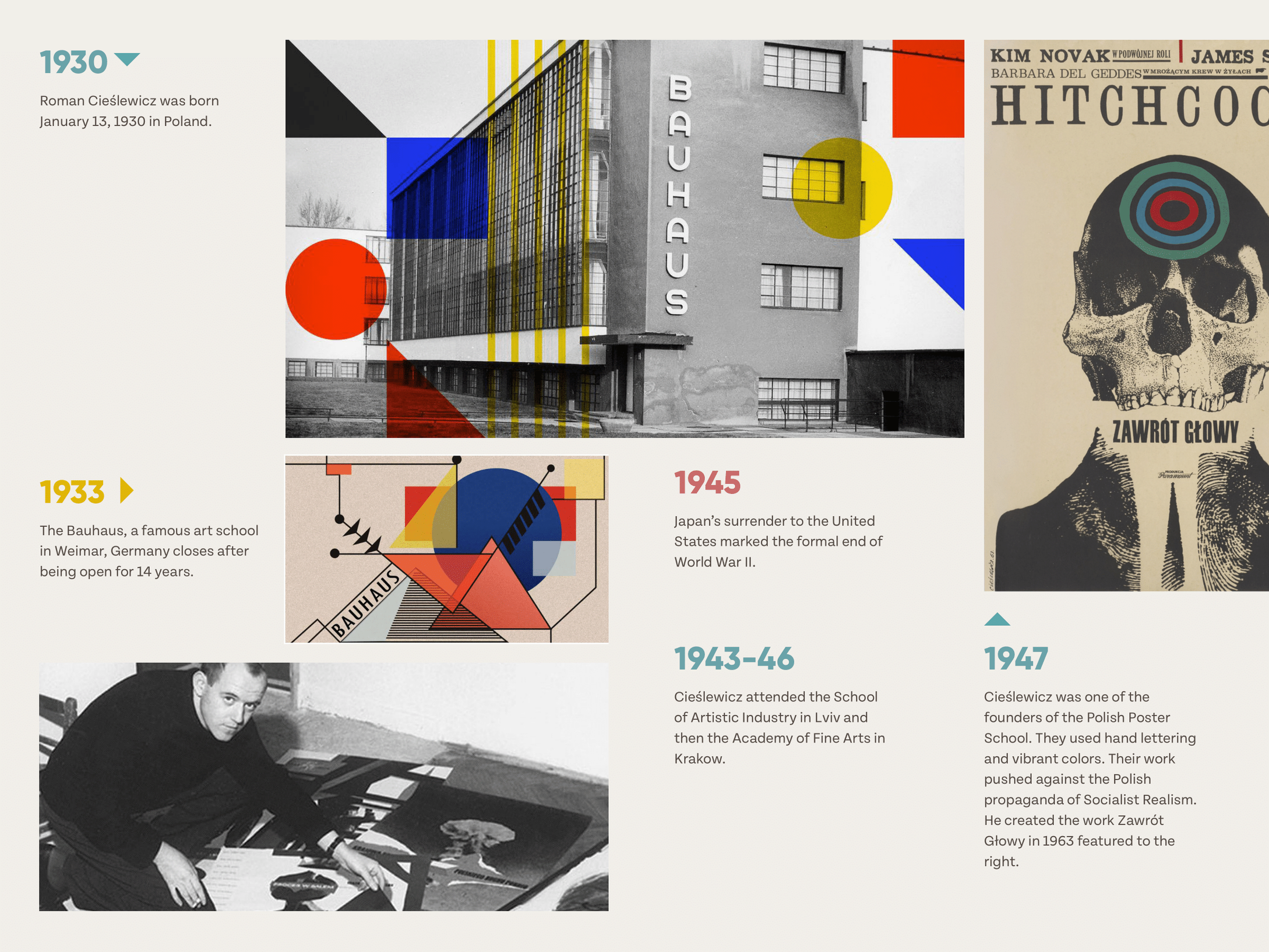
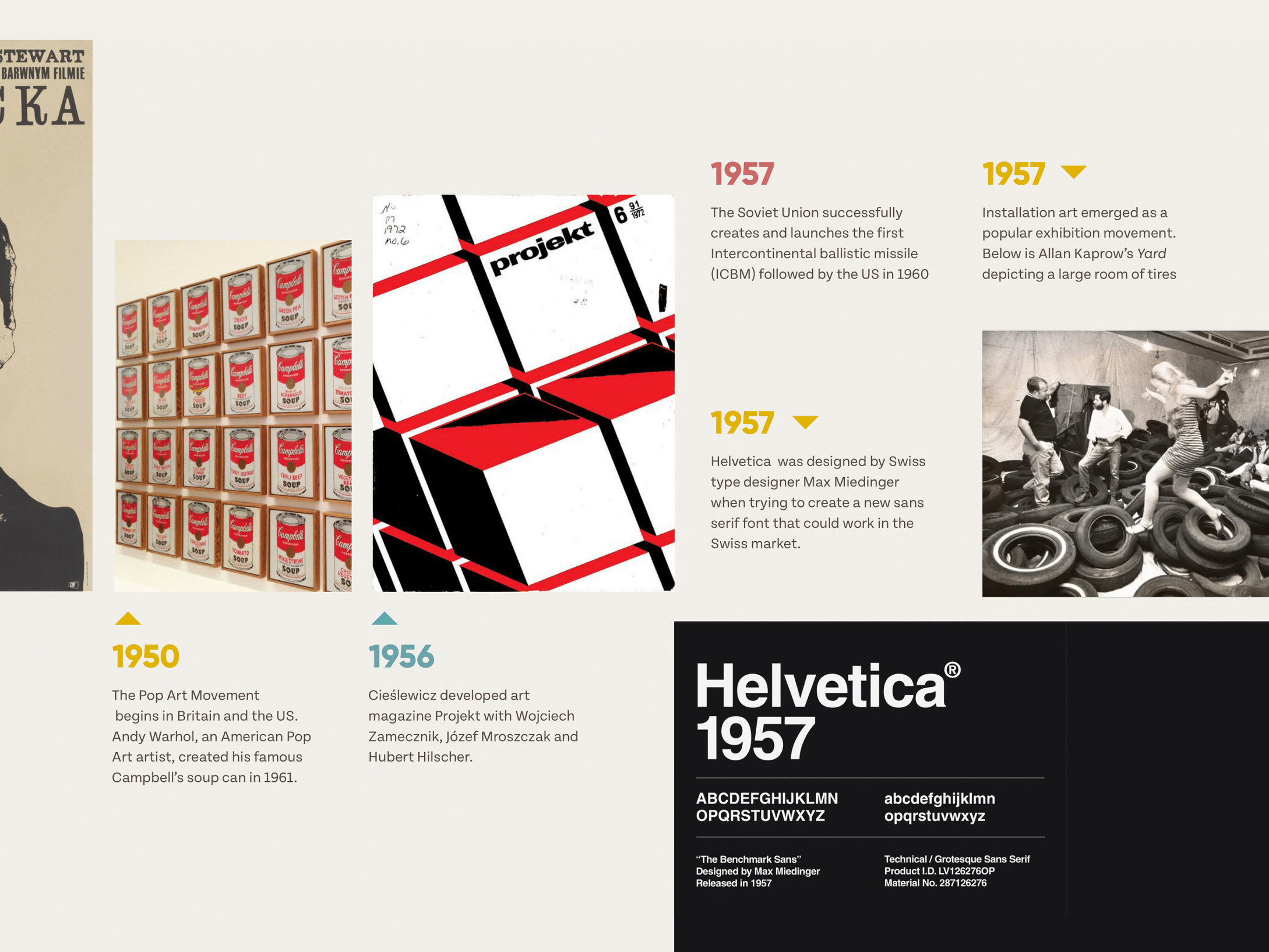
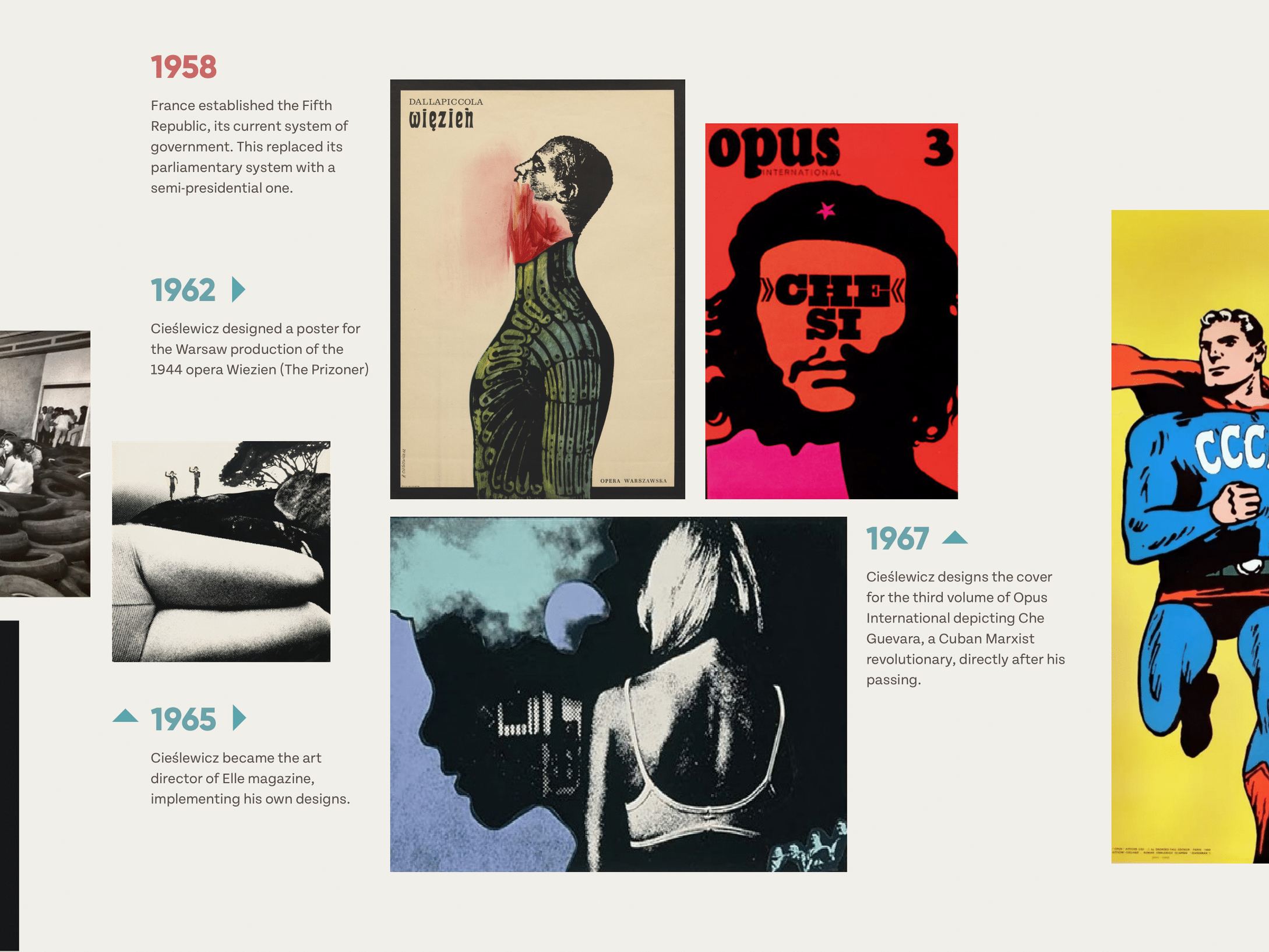
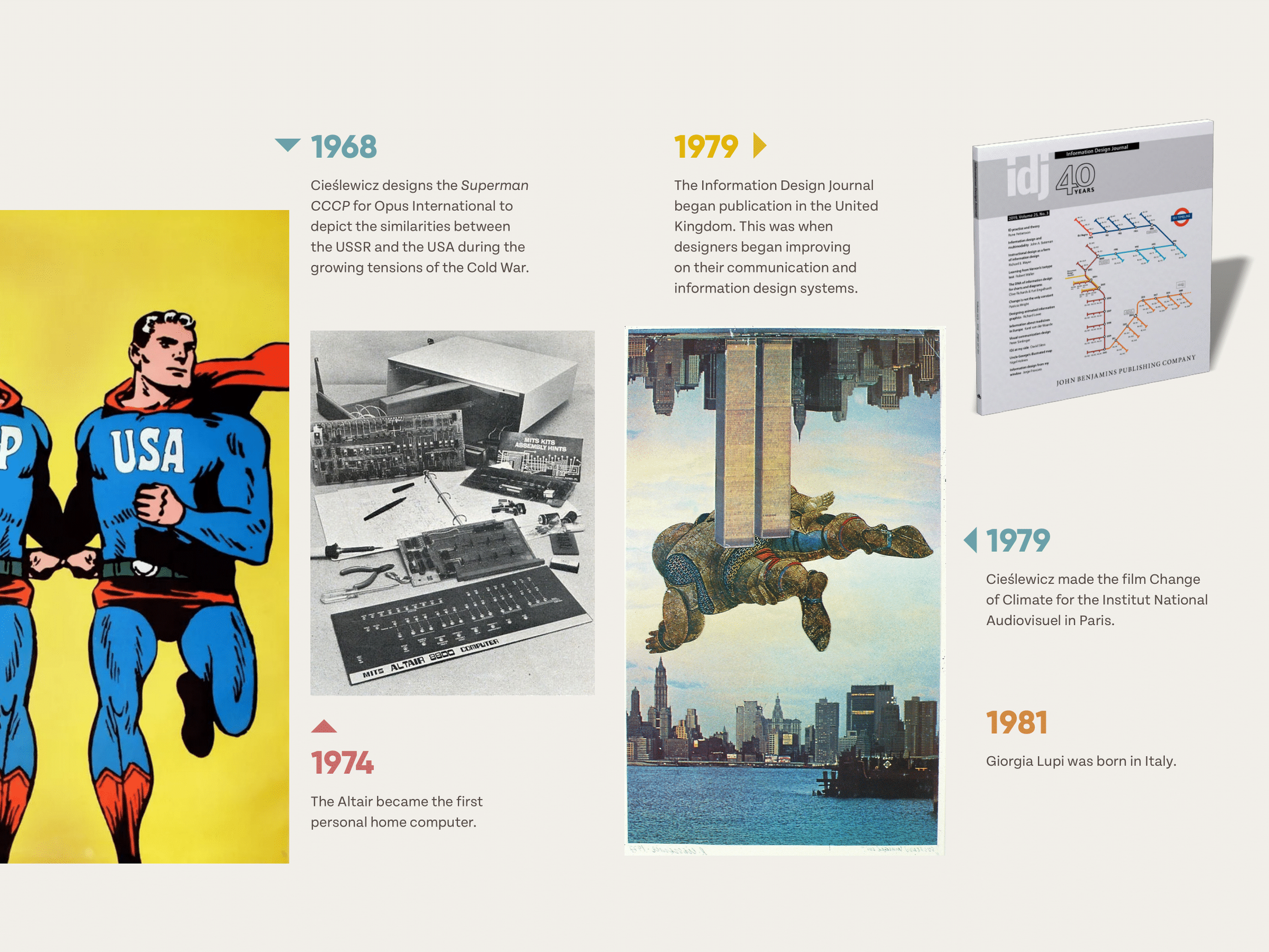
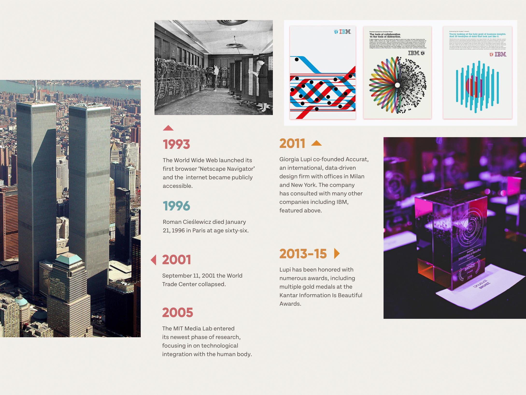
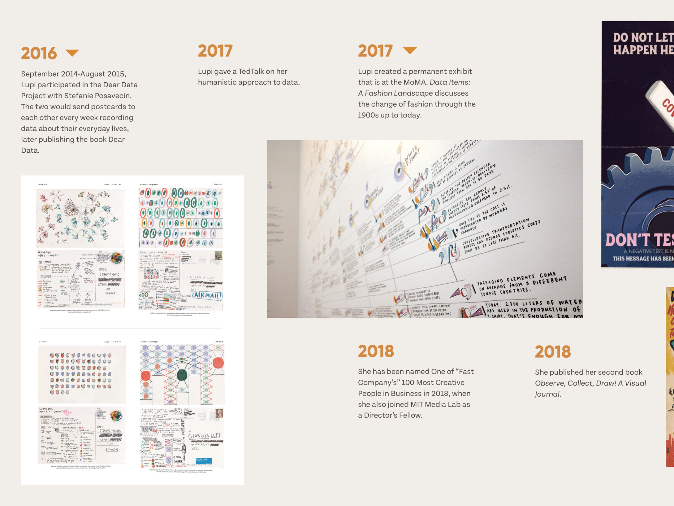
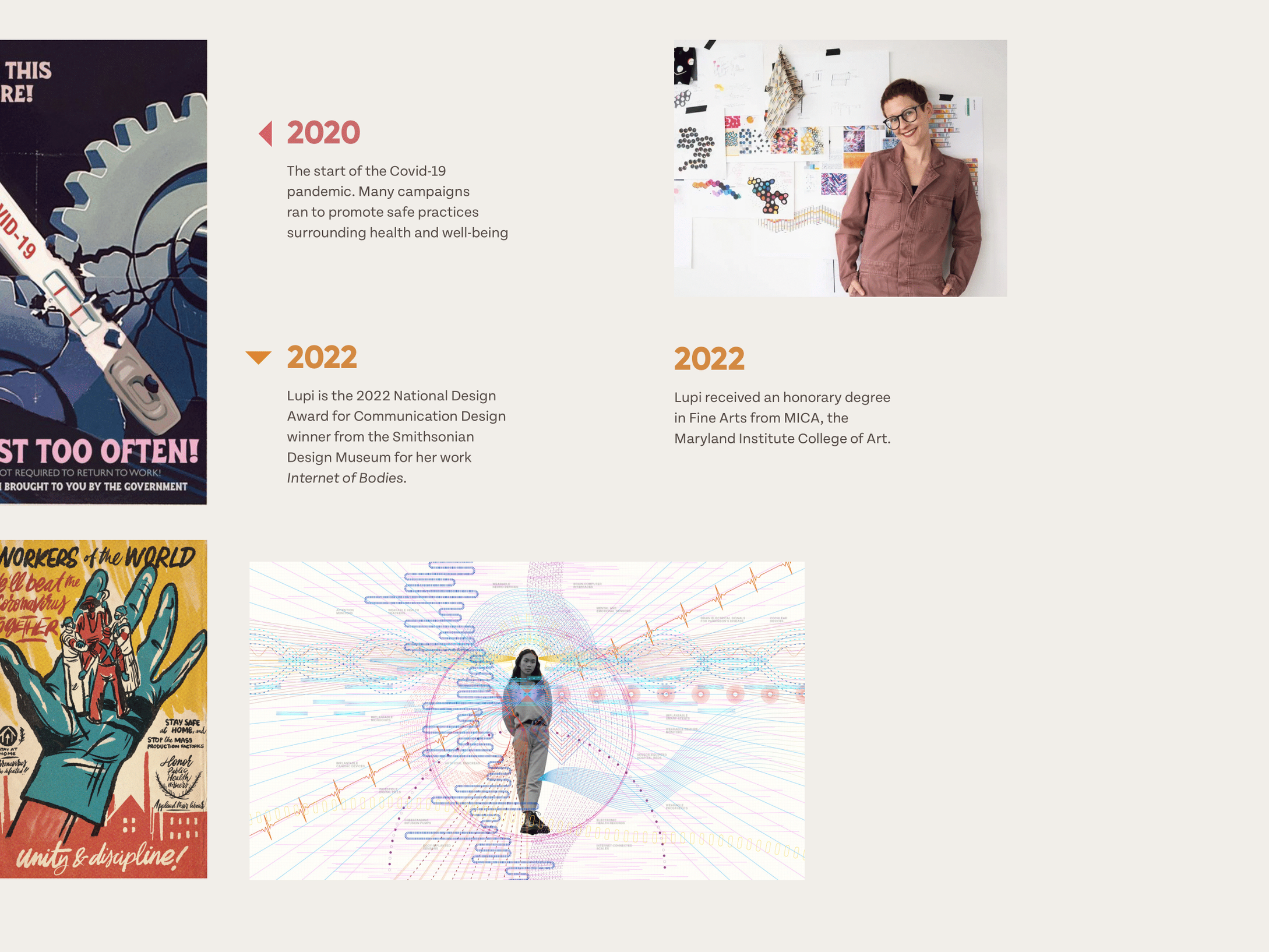
In this project, my goal was to design a seamless and visually engaging timeline for an accordion style pamphlet. The timeline depicts the lives of two designers along with a series of historical events and important changes in the art world.
When designing my layout, I made sure to take into account how the final design was going to be presented. Each image wasn't just going to sit on a page by itself. Instead, the booklet could also be unrolled and looked at in its entirety. Because of this, I was very meticulous to make sure the text remained readable while the images flowed seamlessly from spread to spread.
The colors here help delineate the different subject matters contained within the bullets with arrows that direct the captions towards their specific reference images. This helps to clearly communicate information throughout the entire timeline consistently.
❋ Designer Timeline

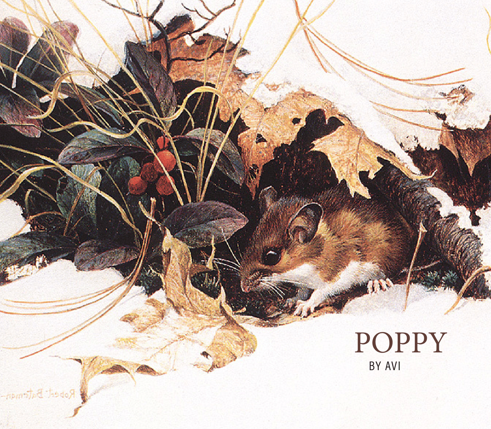
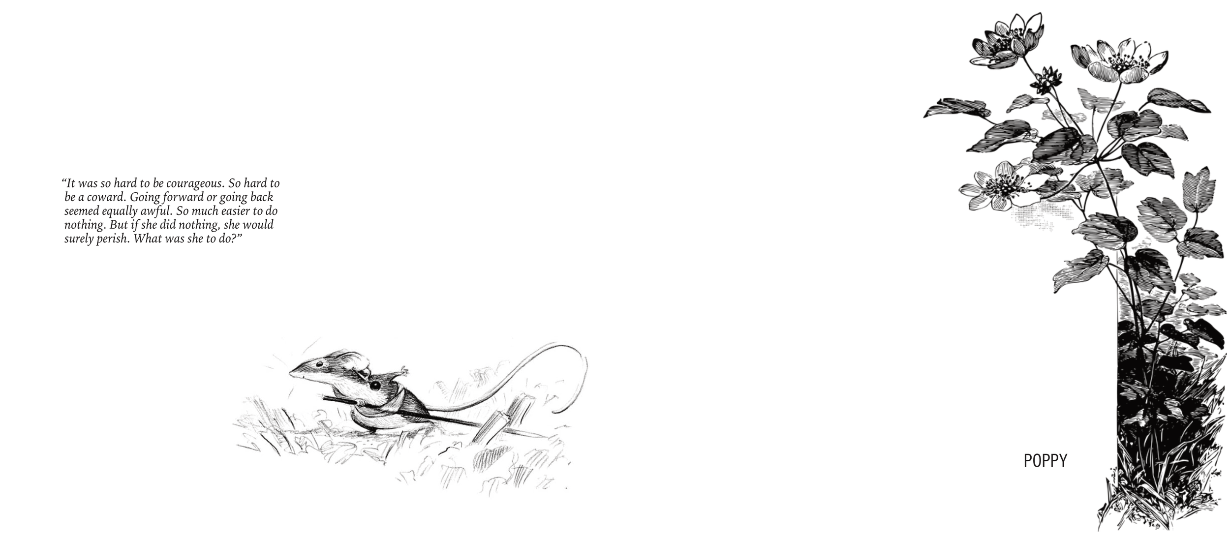
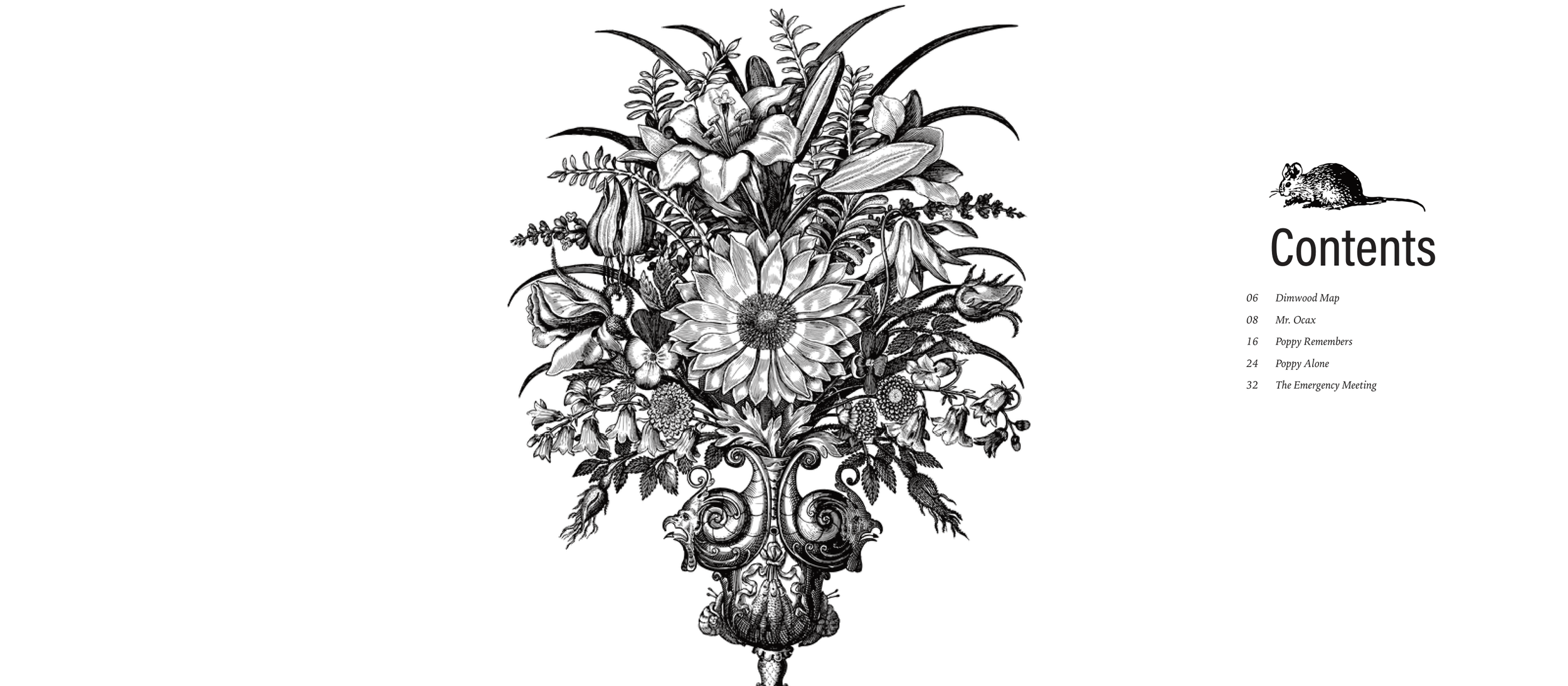
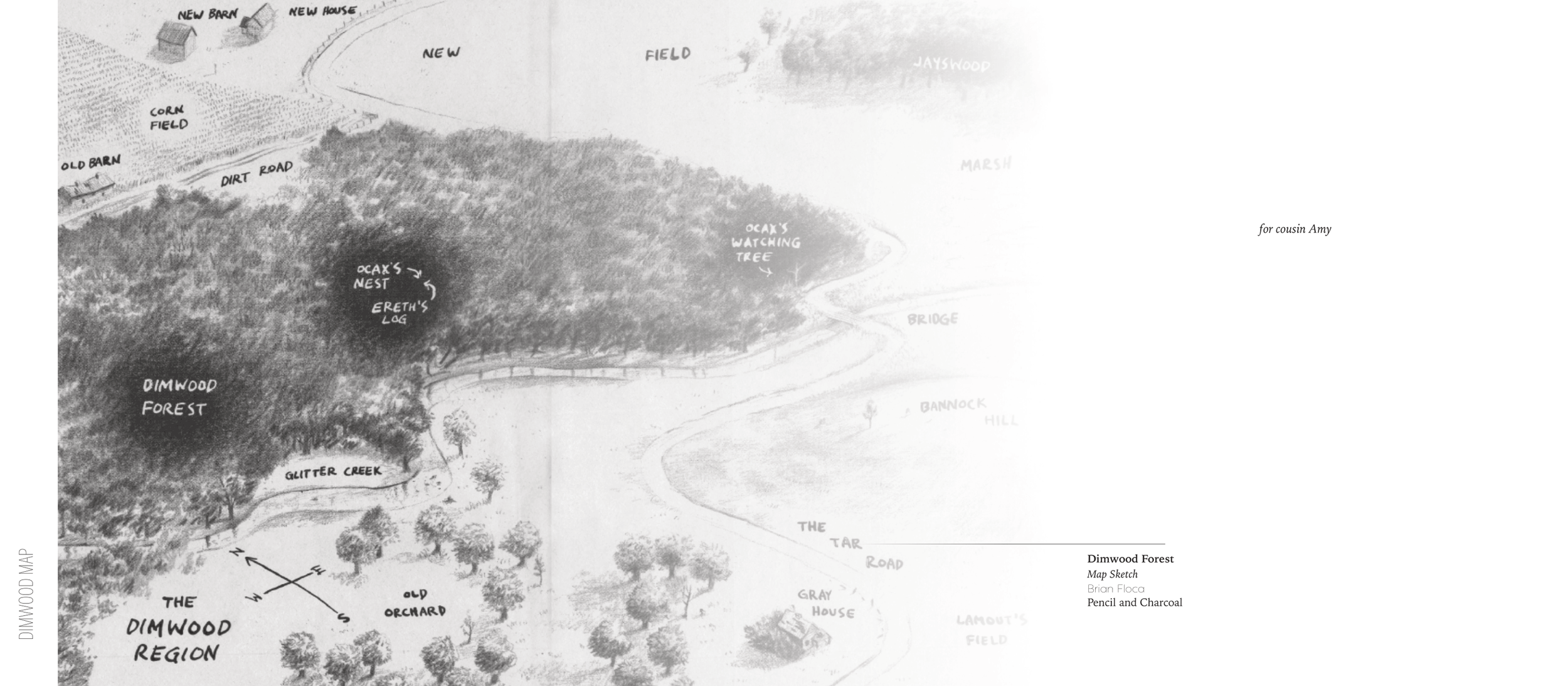
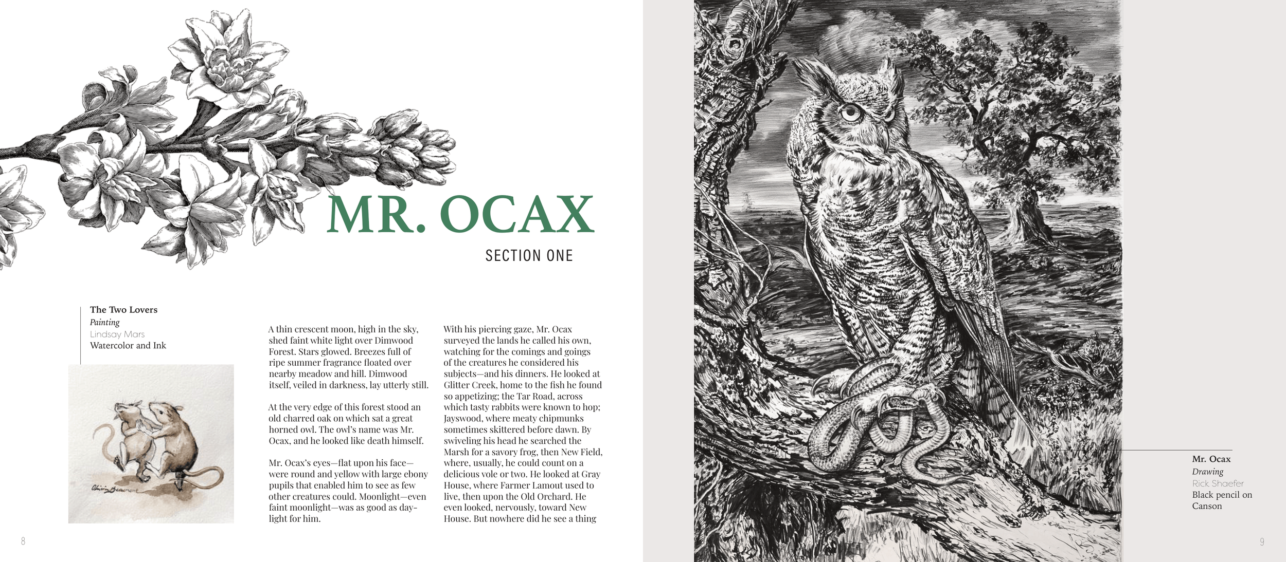
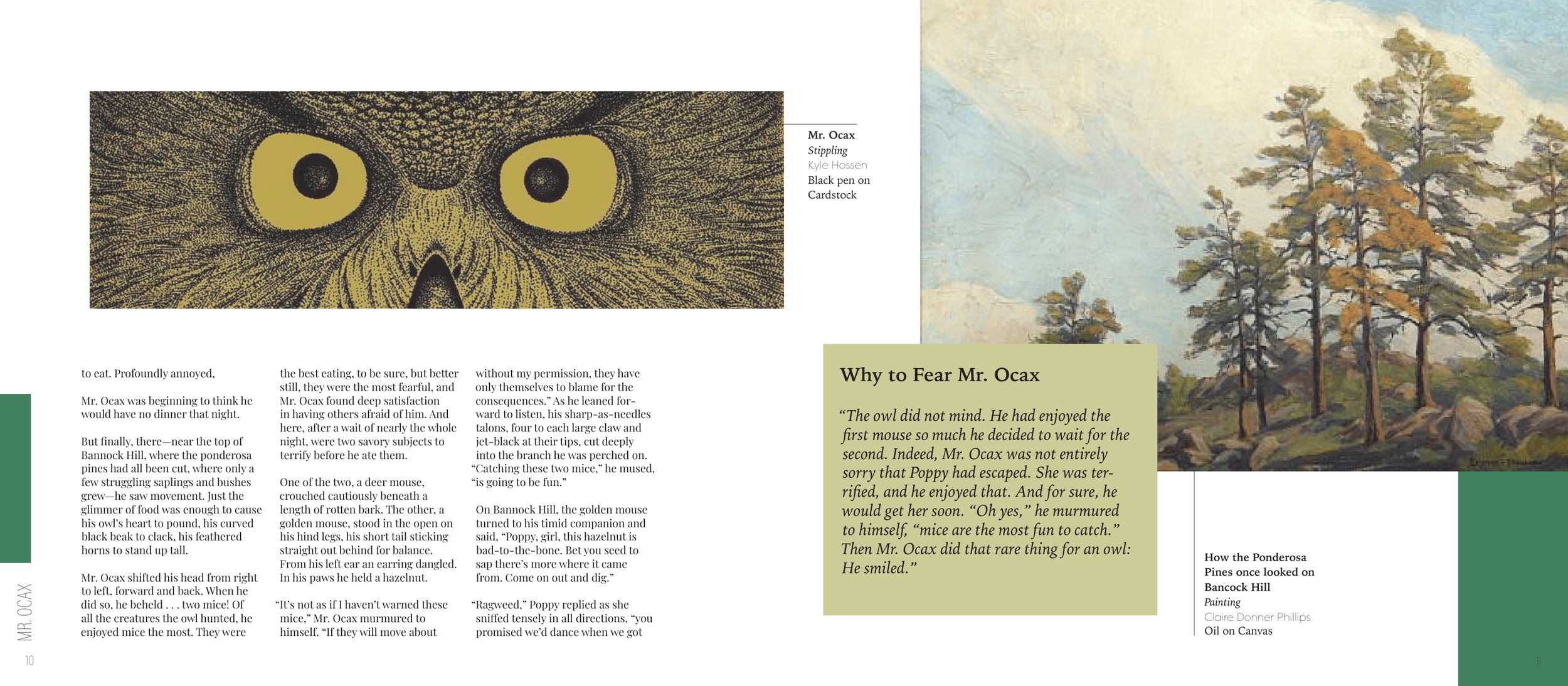
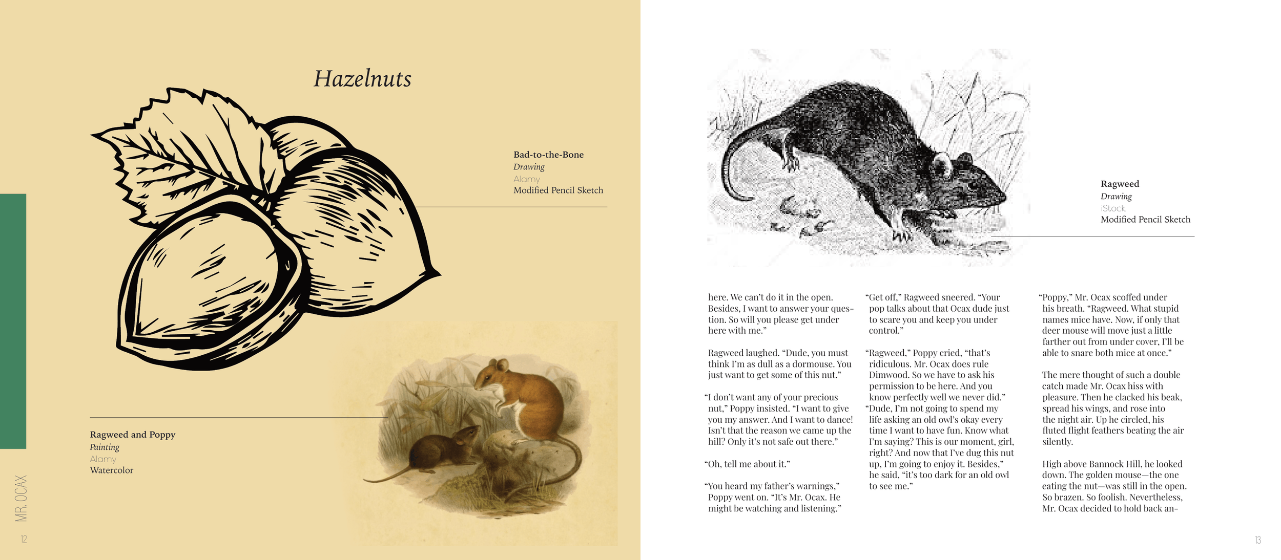
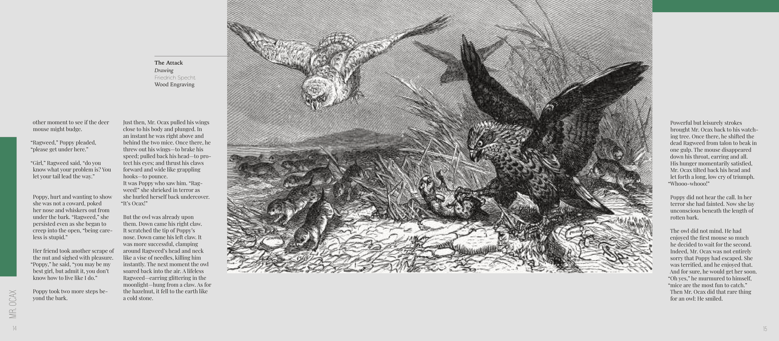
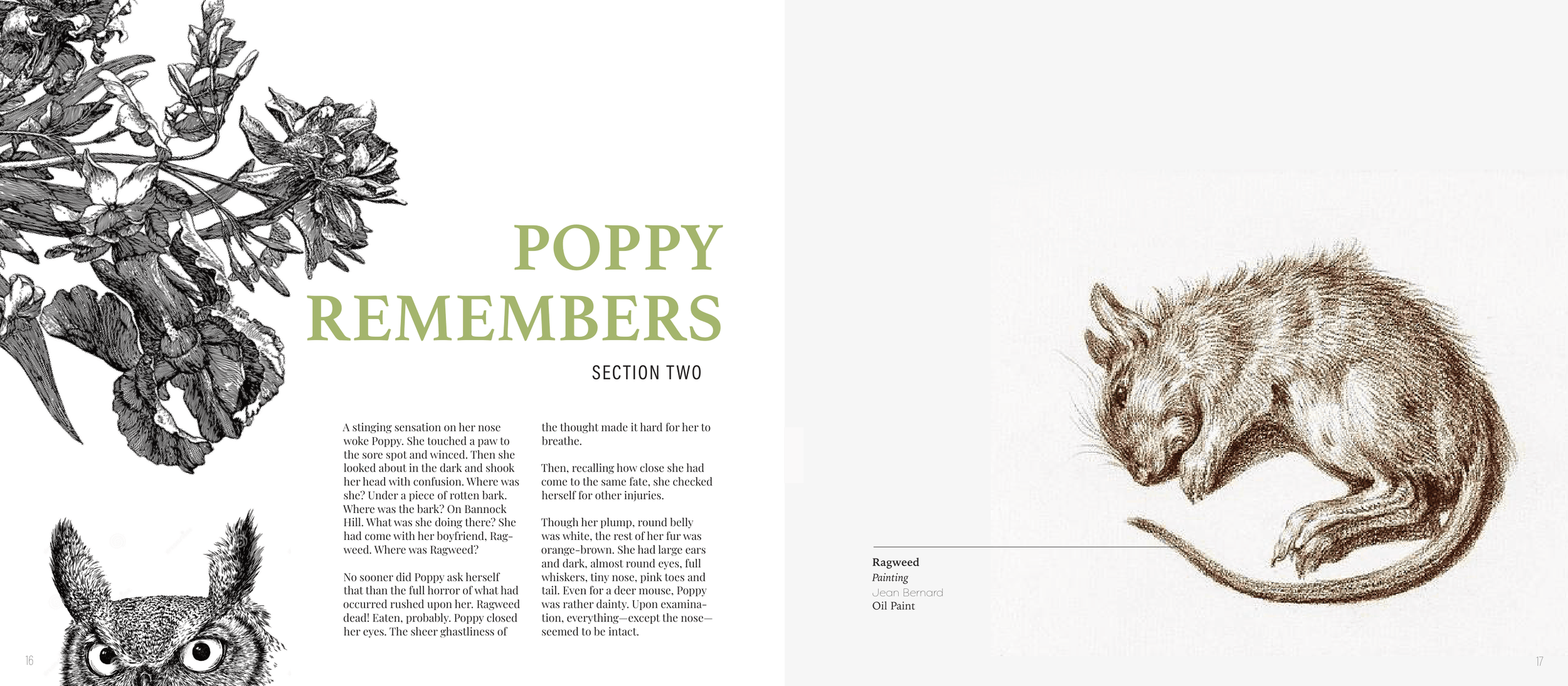
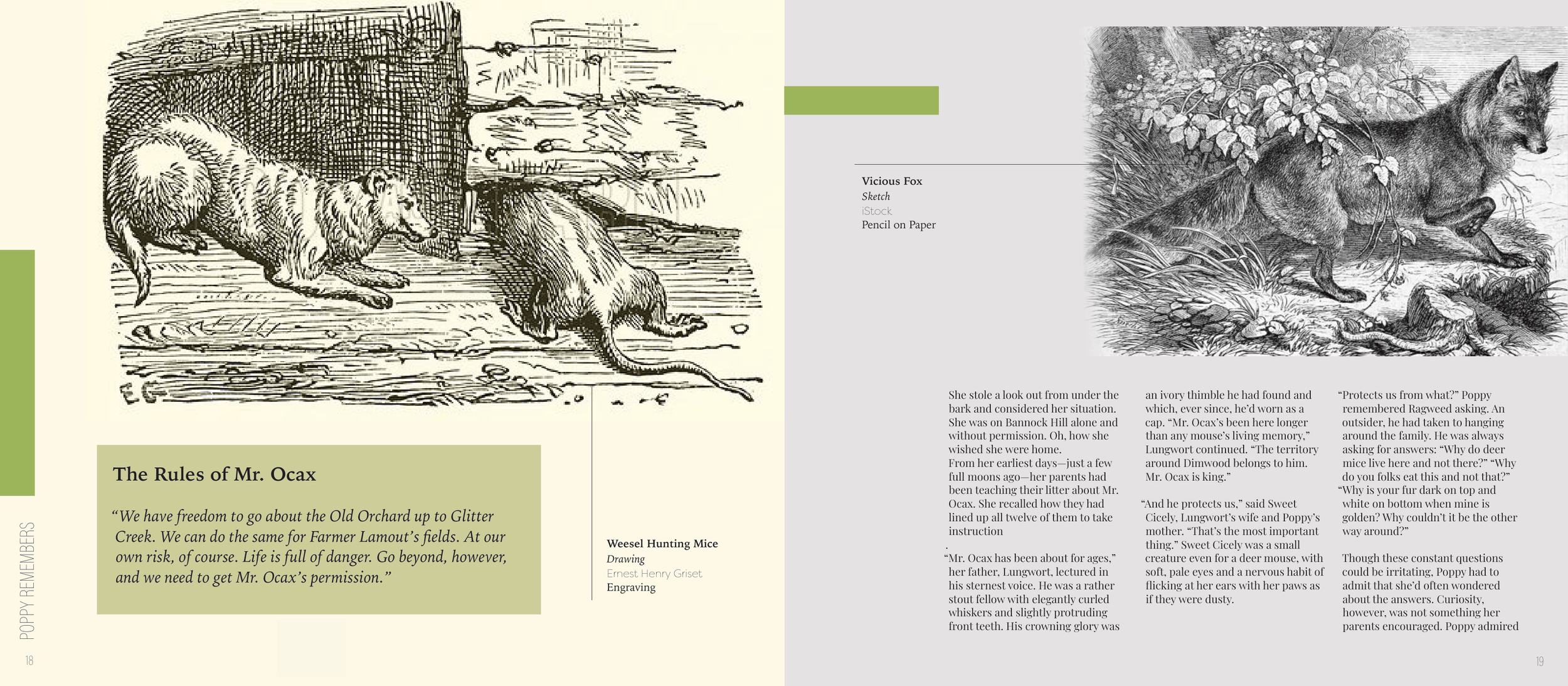
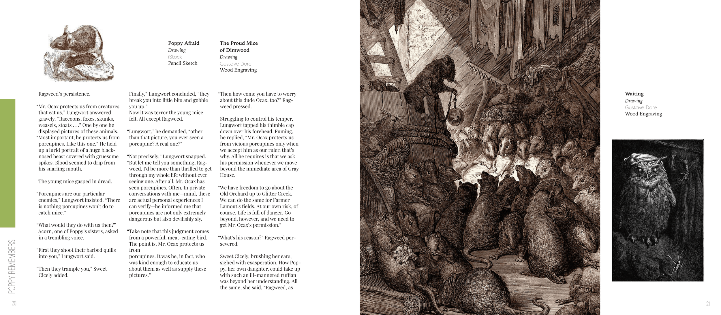
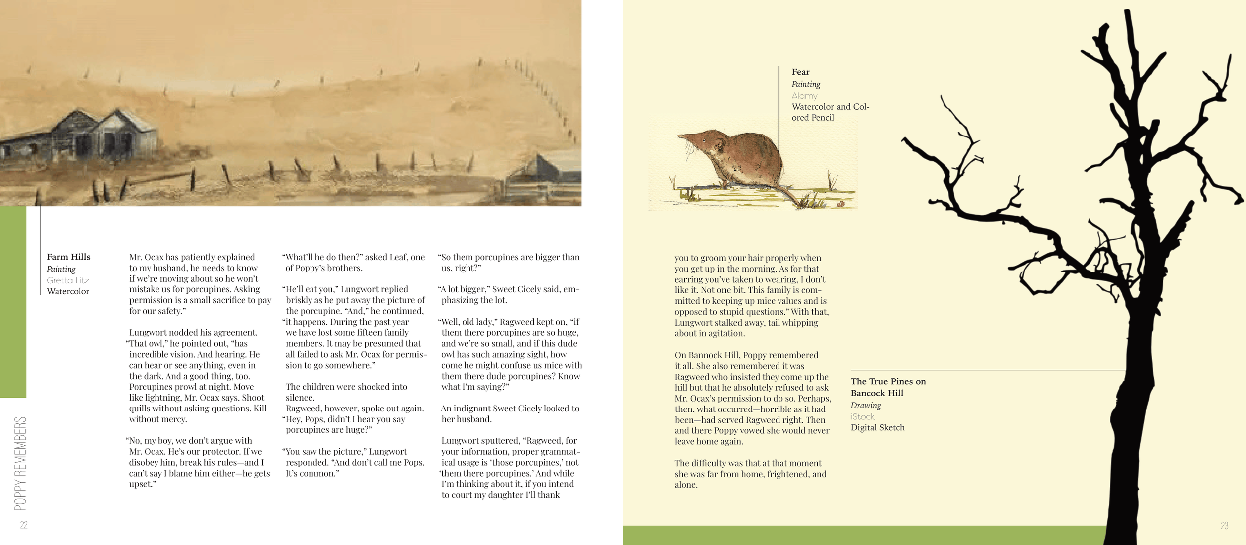
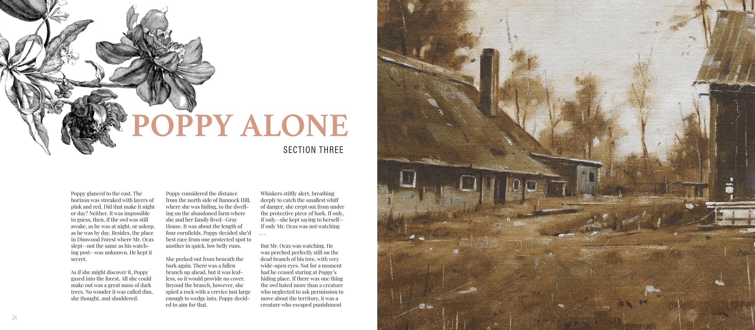
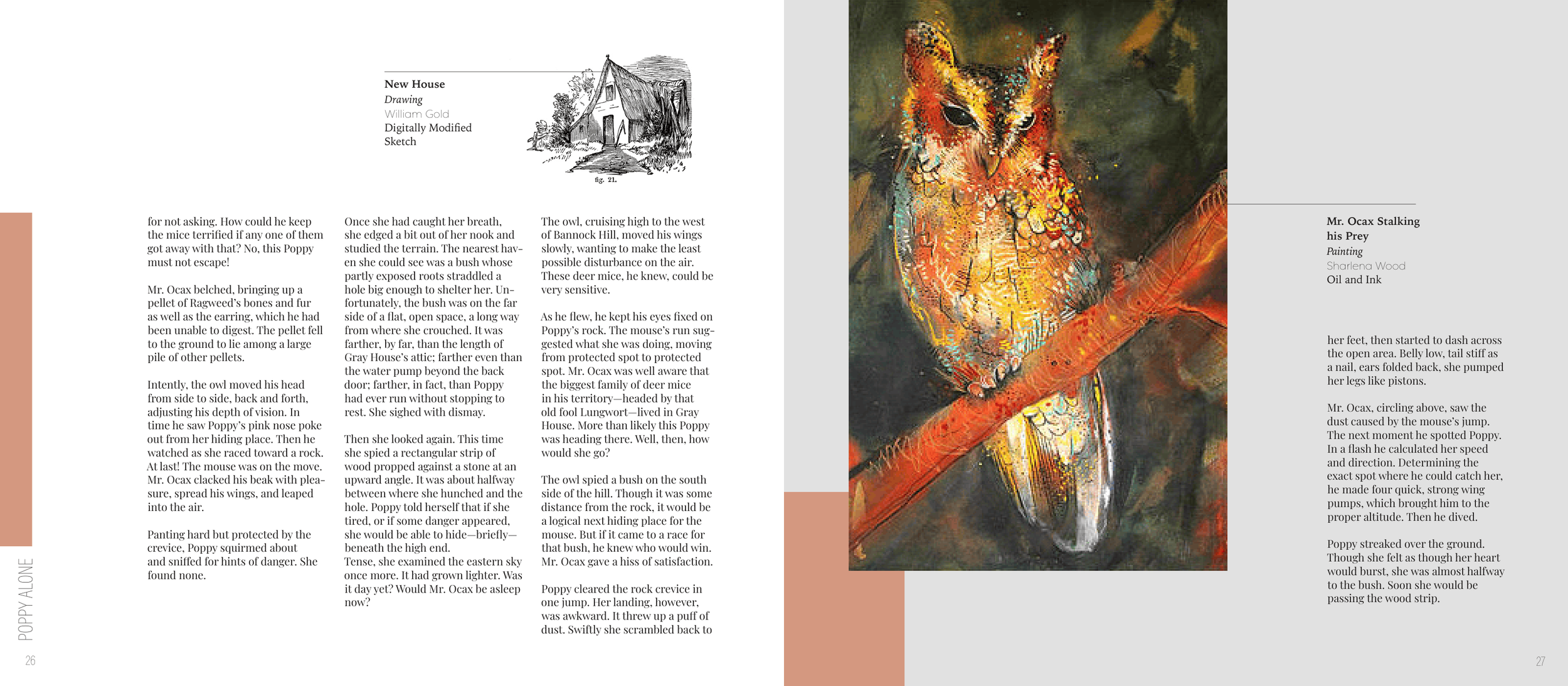
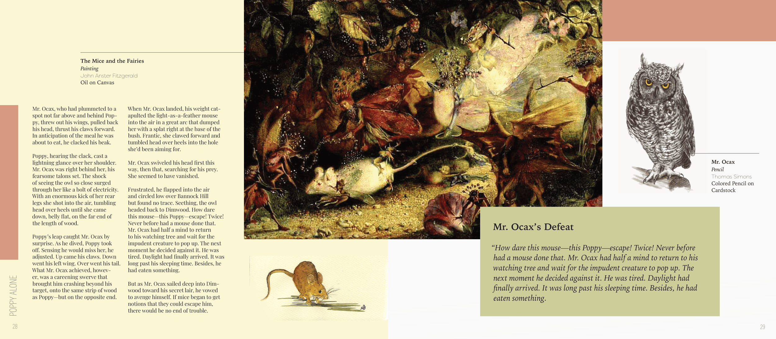
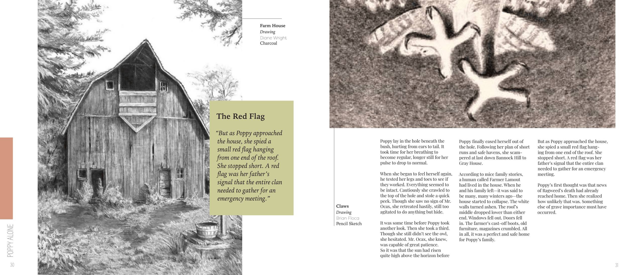
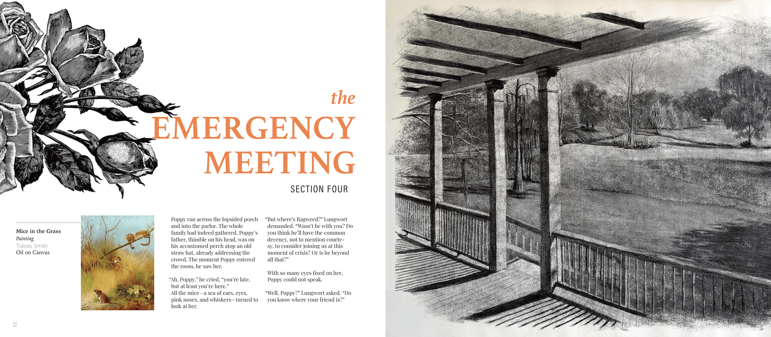
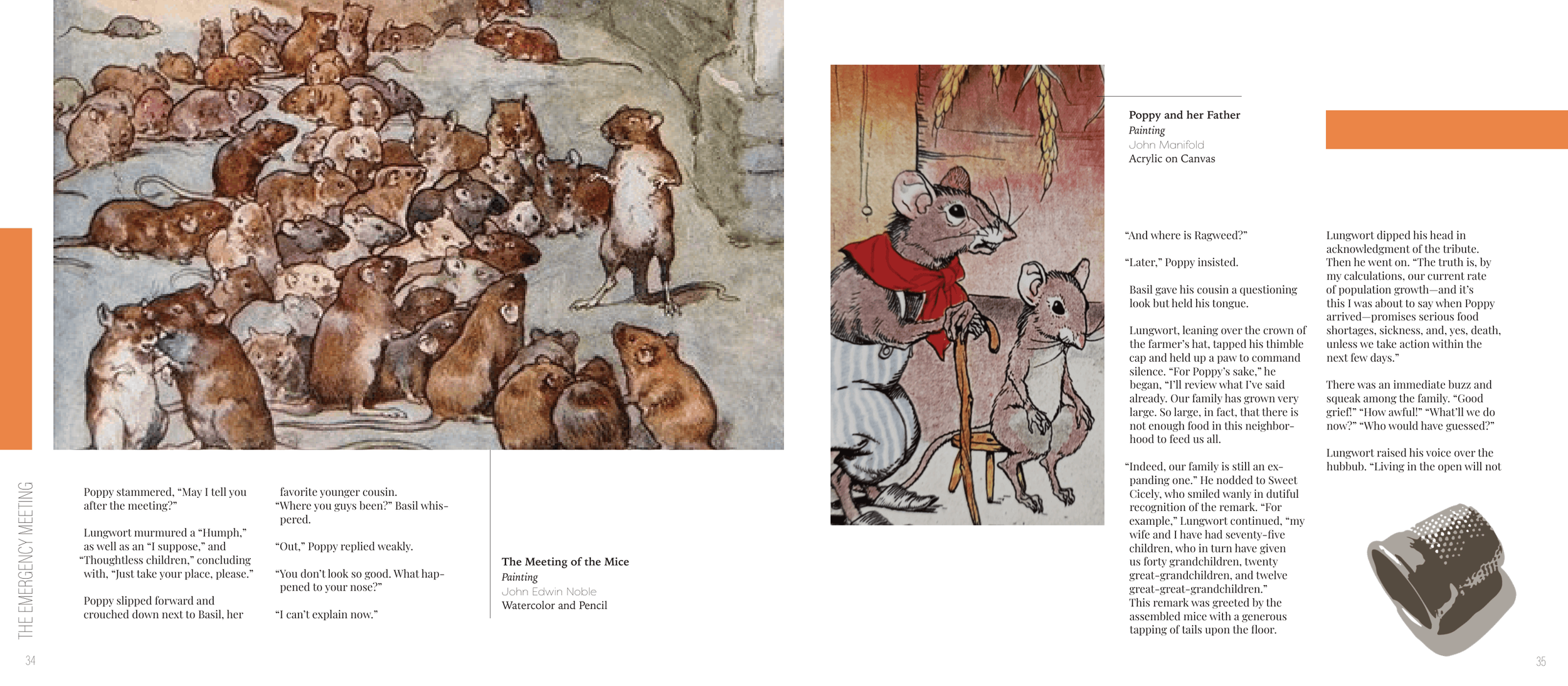
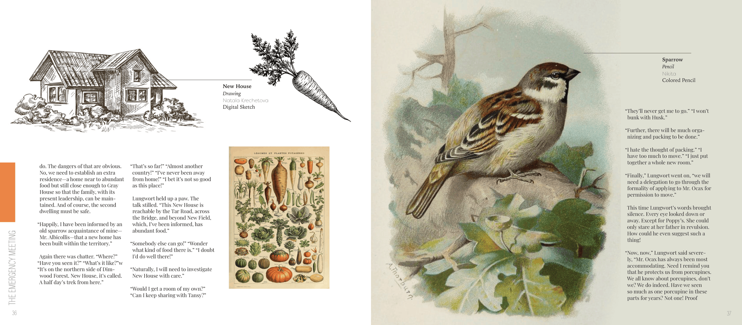
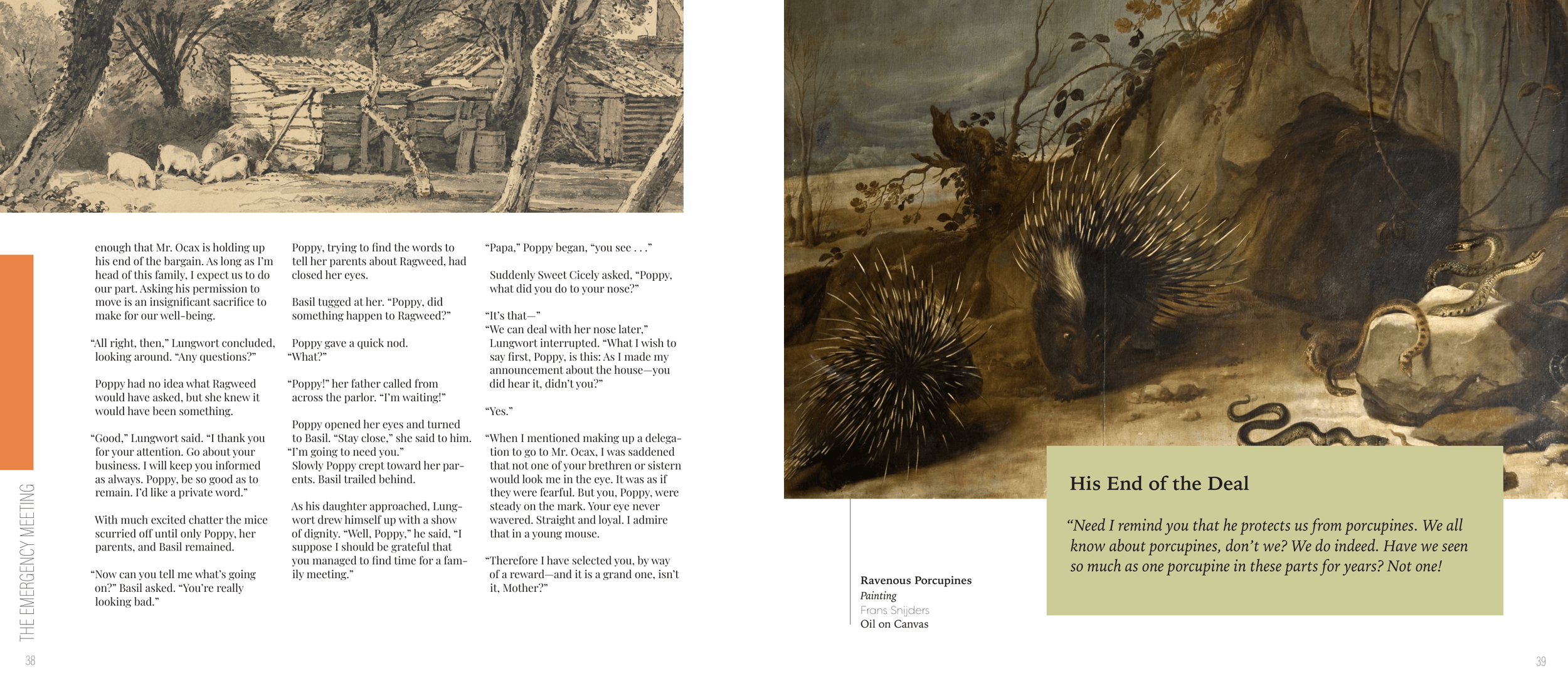
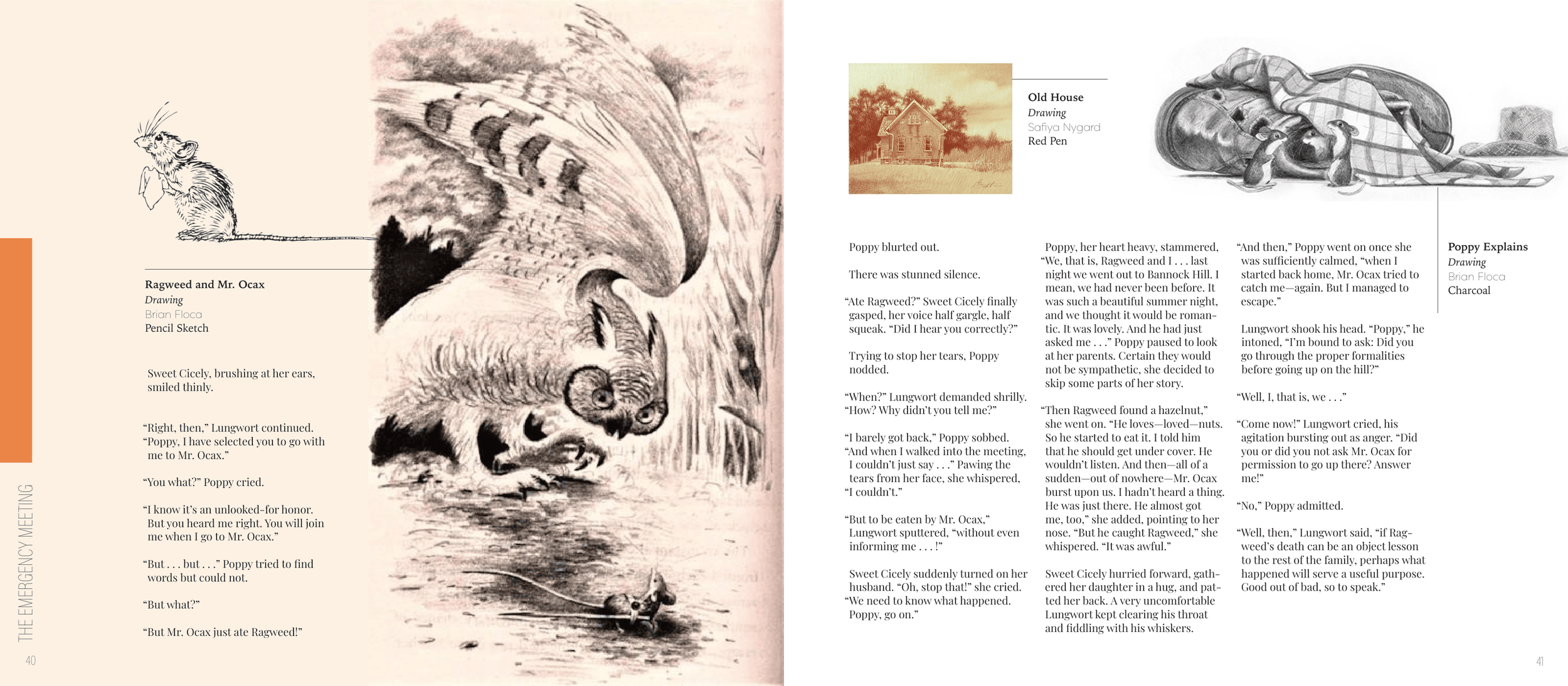
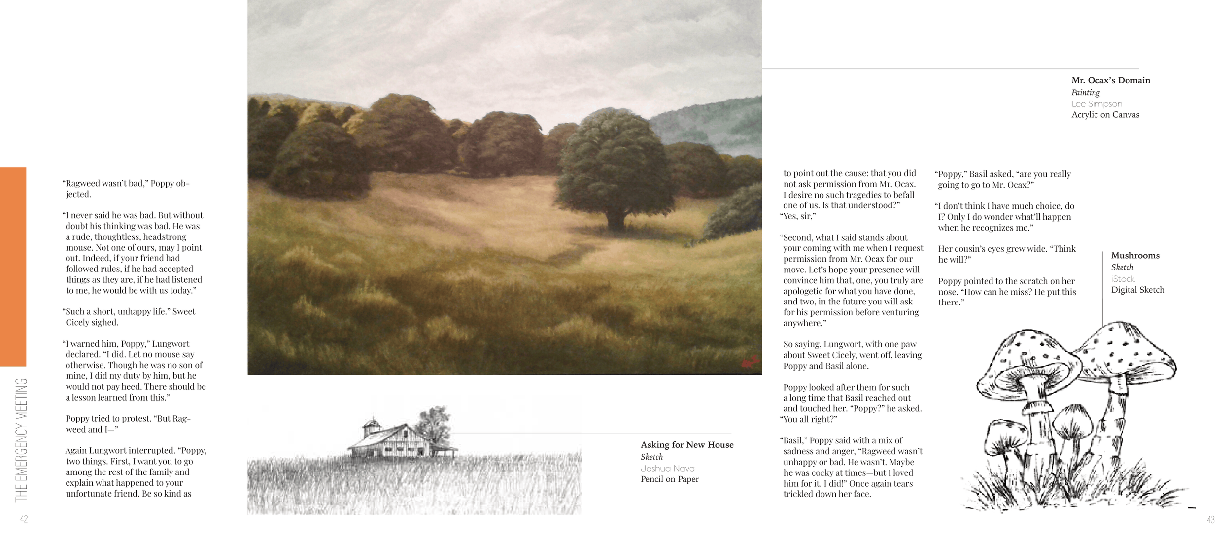
I was tasked with reformatting any book of my choice and adding a series of images to the layout. I choose a childhood favorite of mine, Poppy. The general feel of Poppy is that of a folk tale: the story of a small field mouse going on a grand adventure. Because of this, I chose images that were more illustrative and a more muted color palette.