Creativity Warehouse
UI/UX, Identity Design, Layout Design, Packaging Design, Illustration
The goal of my design capstone was to find an opportunity space I see in the world today and create 3 deliverables that help address the pain points of that experience. Through my design solutions, I researched, developed, user tested, and finalized a full campaign of practical products.
Opportunity Space
Once you age out of the education system and become employed full time, there are very few opportunities for learning and pursuing new creative endeavors. Many people, after high school and college, find that they have creative hobbies they want to pursue, but don't know where to start. They are no longer being provided with the clubs and activities given to children, teens, and later, retirees.
Project Impact
My goal is to understand and create a space for people to pursue these new creative aspirations in a safe, fun, and fulfilling way. It is also to help integrate these solutions into their lives in an easy, comfortable, and affordable way.
Ecosystem Mapping
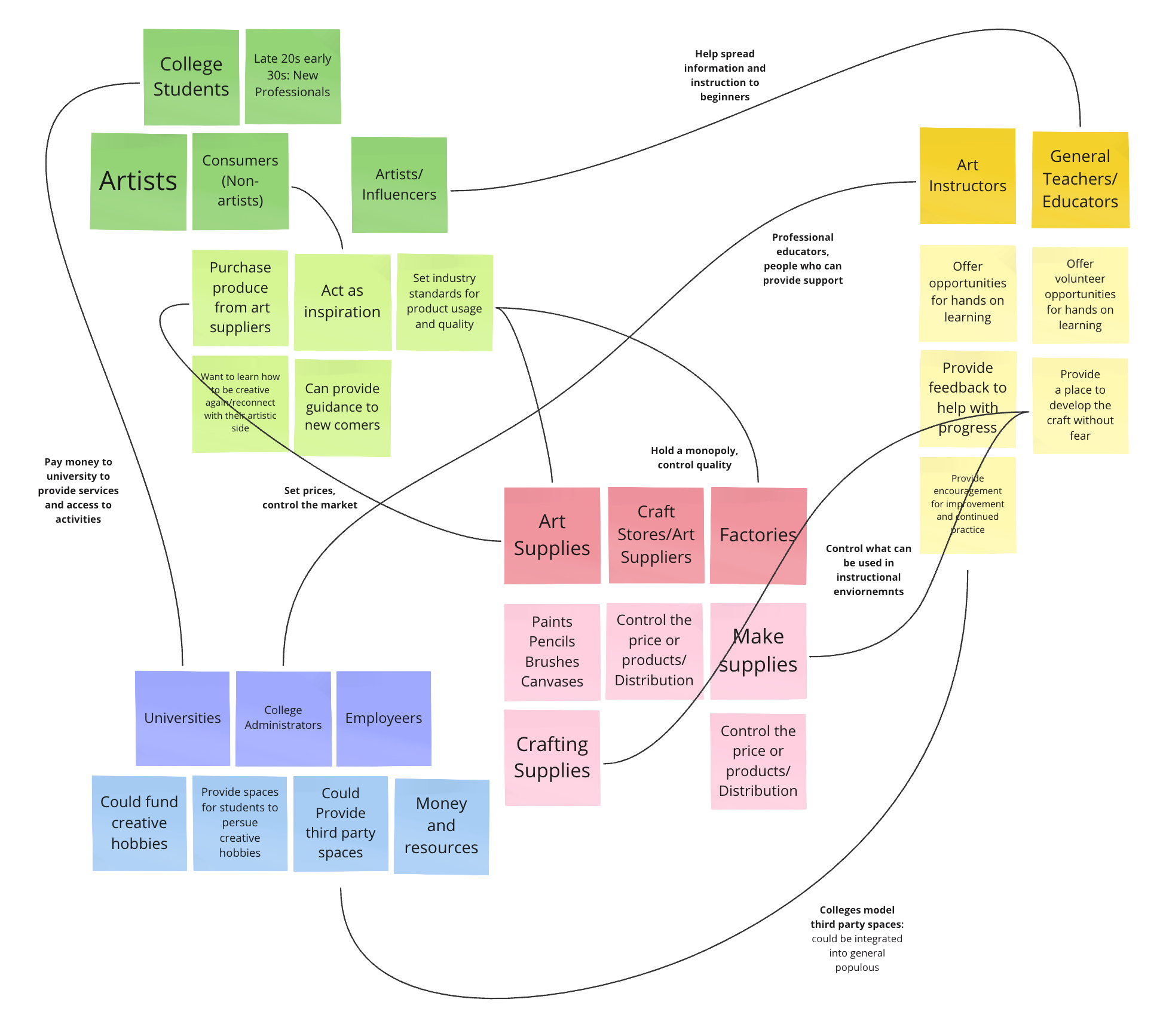
Mapping out the connections between different groups and organizations within the space helped me think through the many different pain points and possible problem areas of the system.
This led me to mind mapping, where I went through the different possible avenues a person could go down when trying to navigate the art space for the first time.
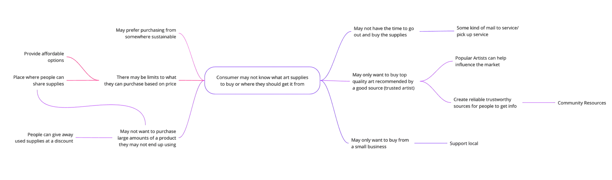
Mind Mapping
How Might We…
How might we provide a comfortable and encouraging creative space for adults to be artistic?
How might we provide people with the resources they need to try new crafts?
How might we carve out the space for people to create without wasting their time and energy?
Tangible Take Home Objects
Prepackaged crafts - no waste of supplies
Book of how to navigate buying supplies
A portable idea book - draw “on-the-go”
Take home activities
Ideation
Visual Campaign
Motivational Posters
An advertising campaign
Campaign that encourages pursuing art
In Person Classes/Resources
In-person classes
A community space
Art supply trades/swaps
Free resources at communal spaces
Guided courses for beginners specifically
Events at fairs giving out resources or instructional guides
Online Informational Resources
A community platform
Website - online resources
Online resources and tutorials
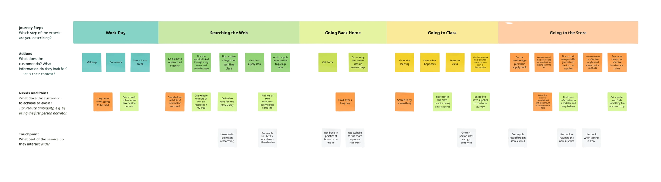
Journey Map
Takeaways
Help expand the use of the book in store, not just at home.
Expand the locations of the resources and all the places you can access the kits.
Address the struggles of the users directly through my resources at key pain points.
❋ Product Drafts
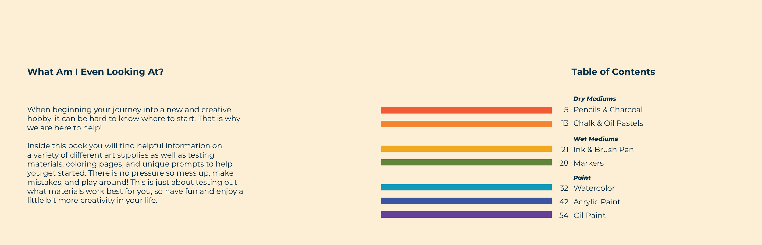
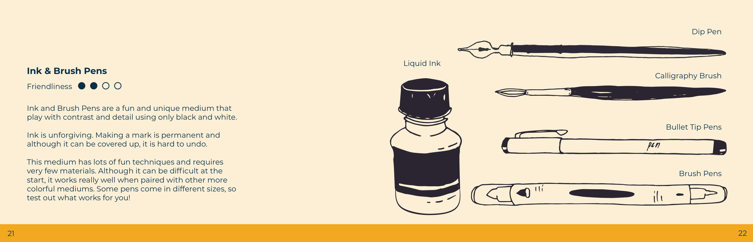
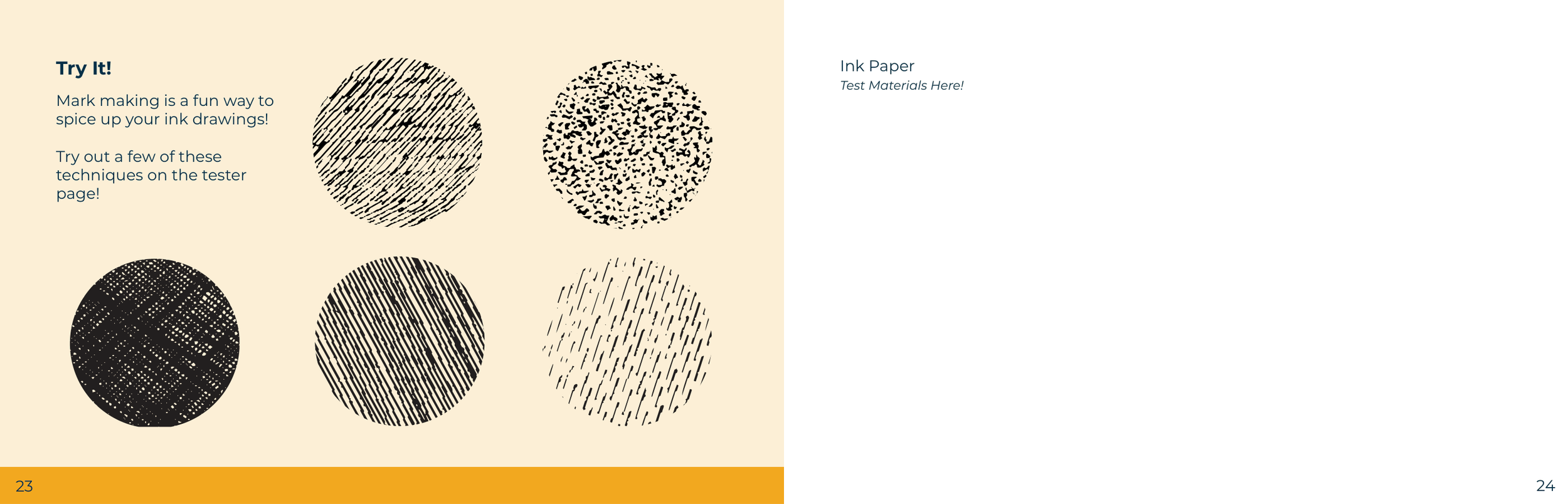
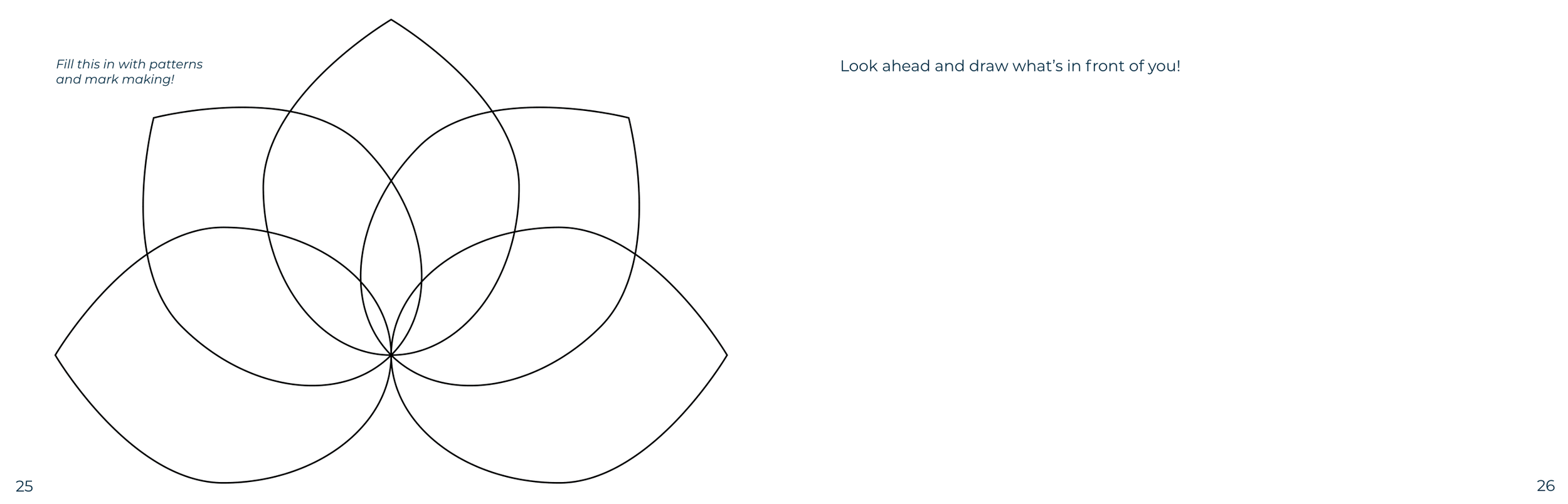
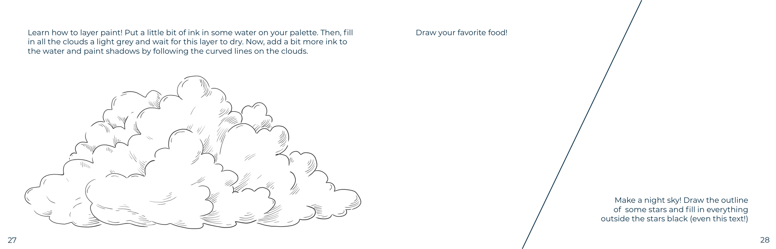
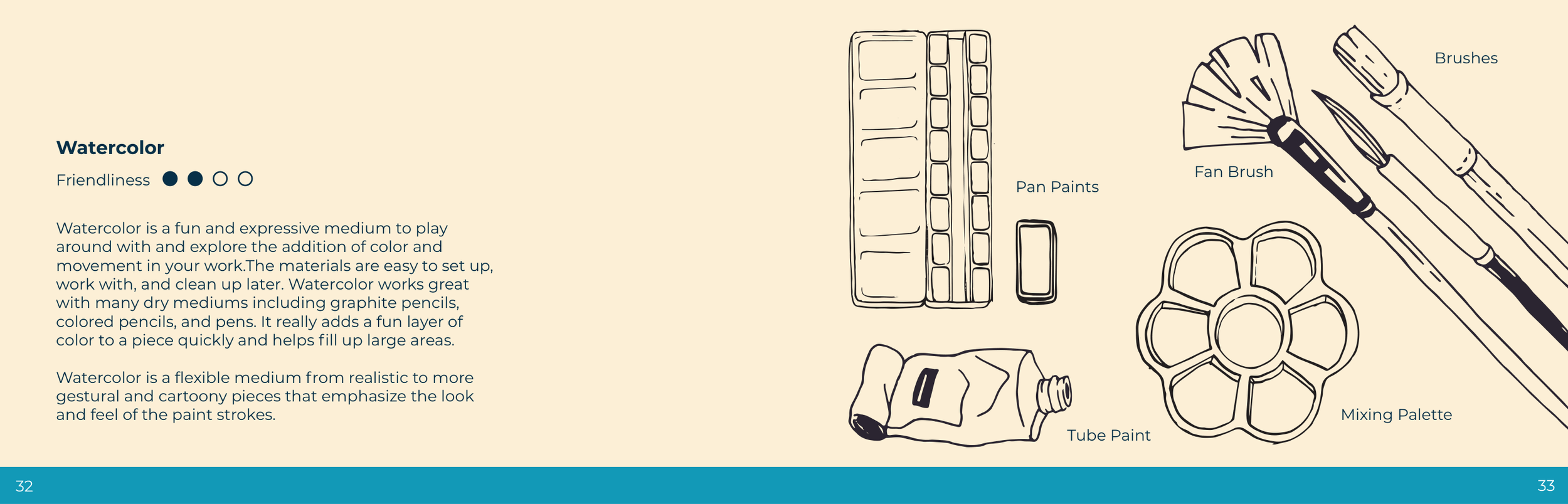
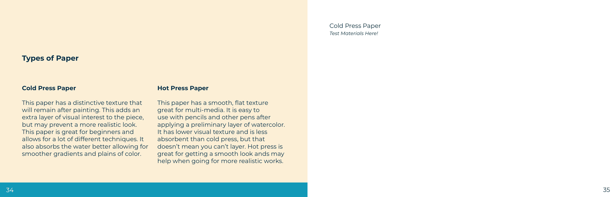
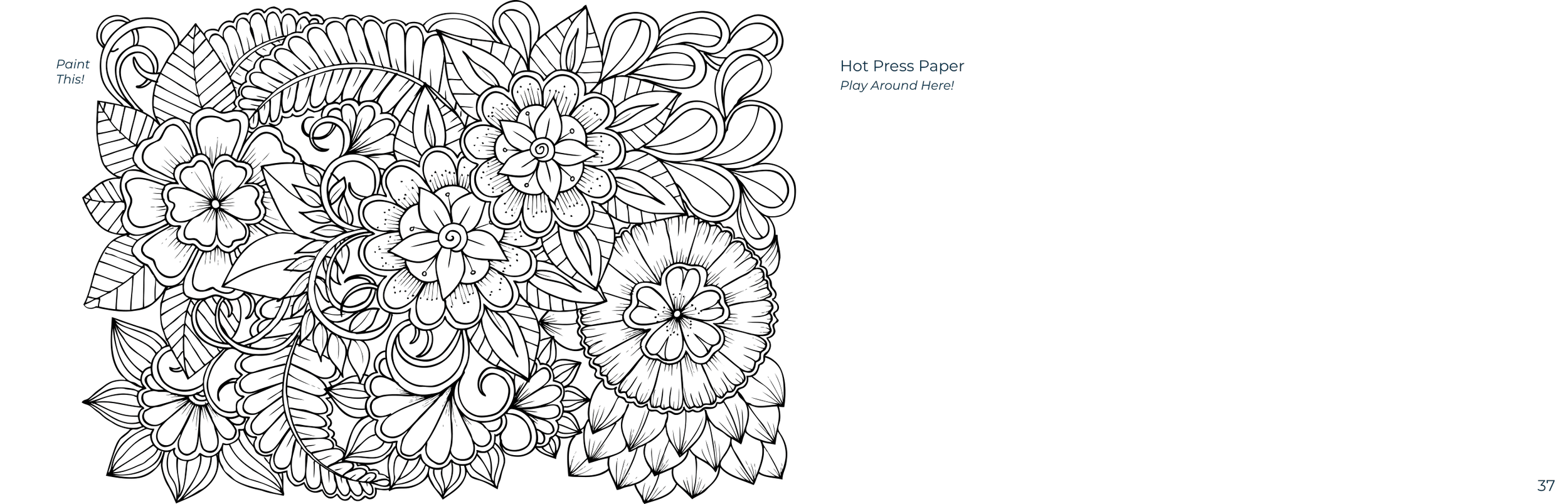
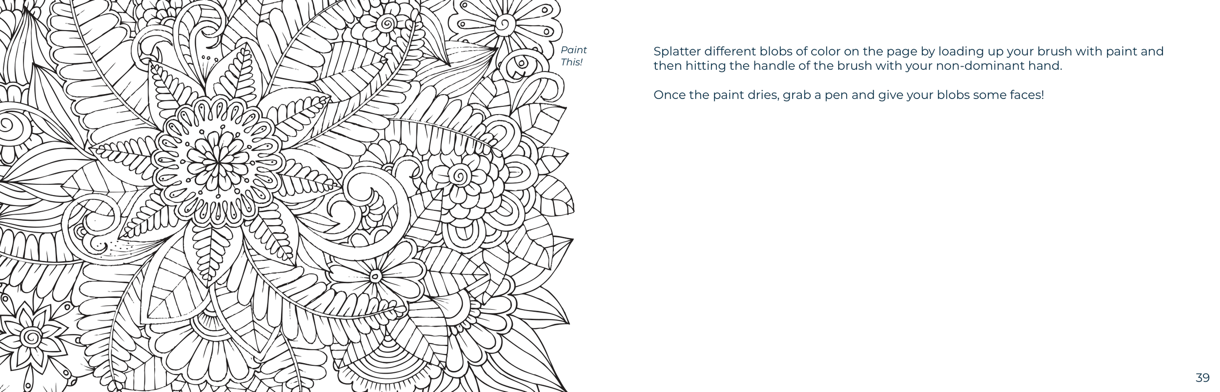
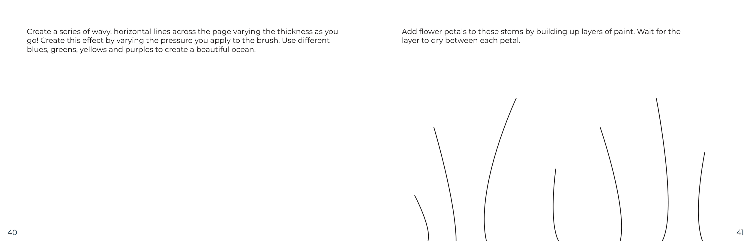
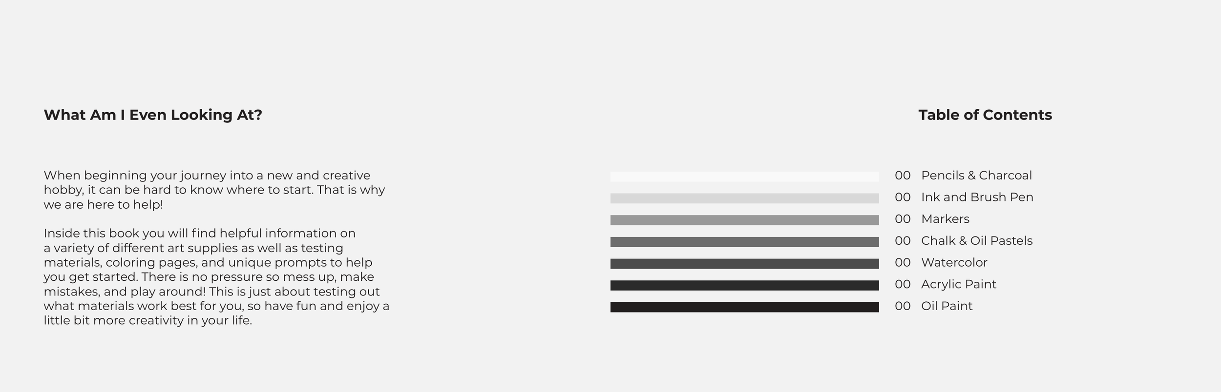
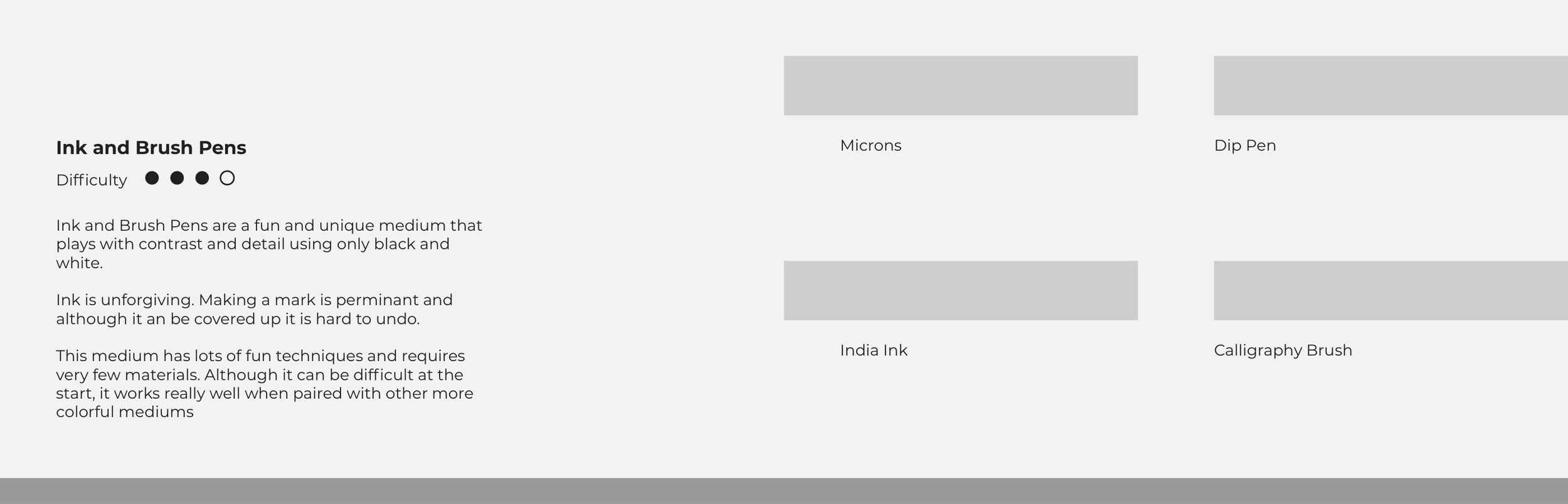
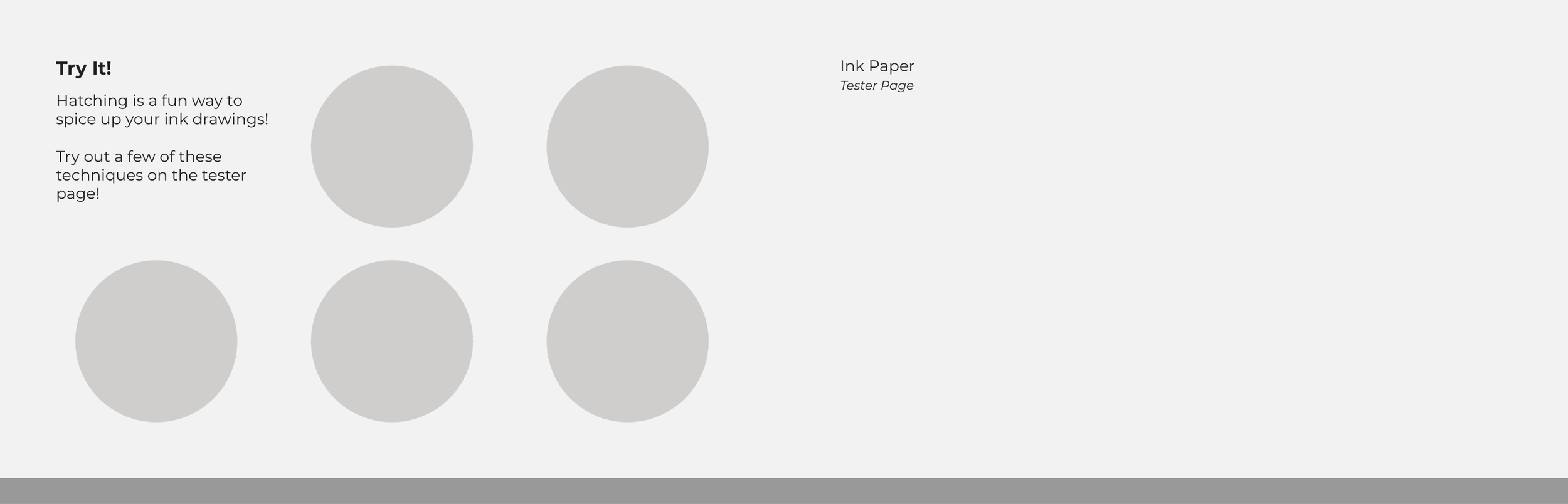
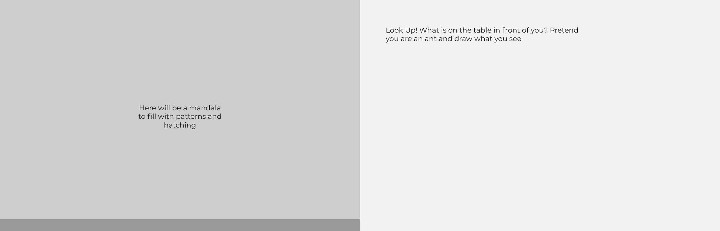
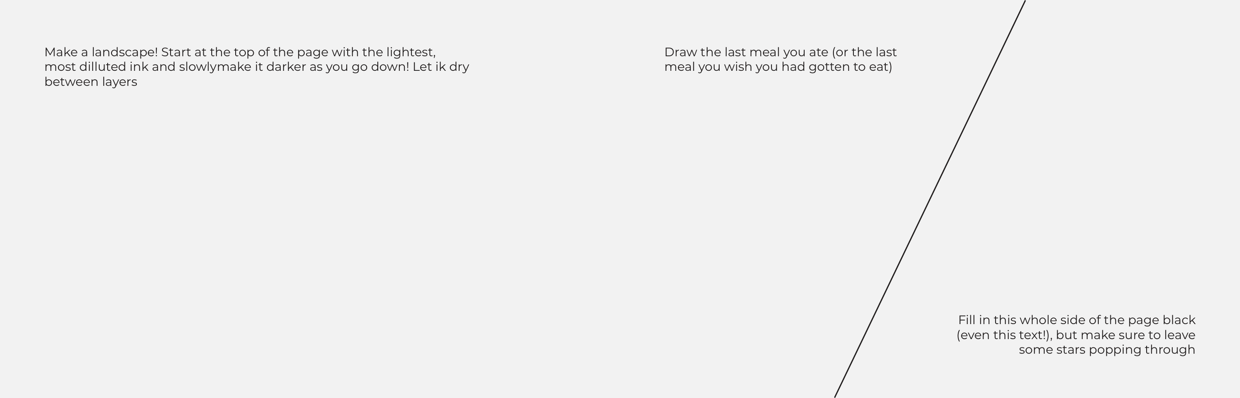
When developing the book, I worked through making sure the layout weaved information in between more fun and interactive spreads.
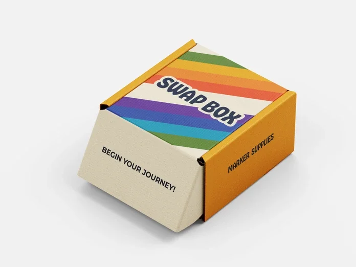
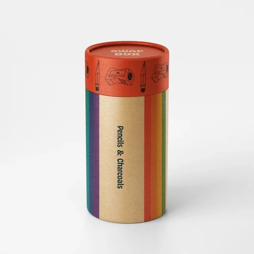
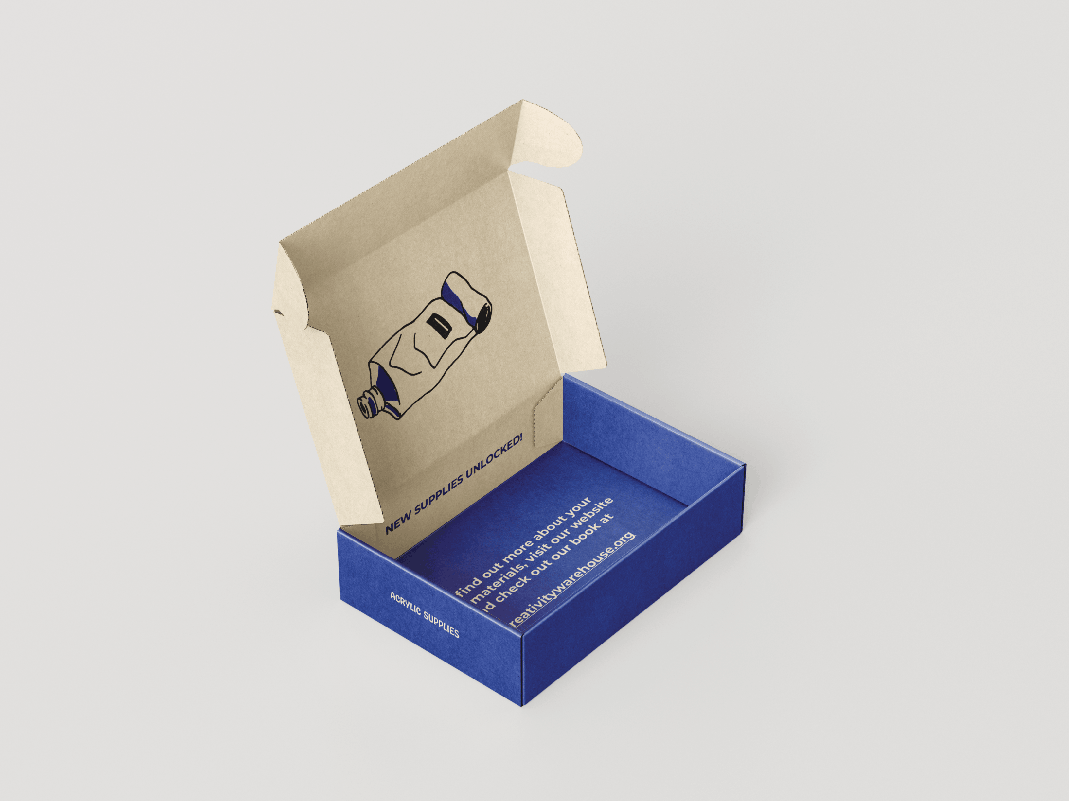
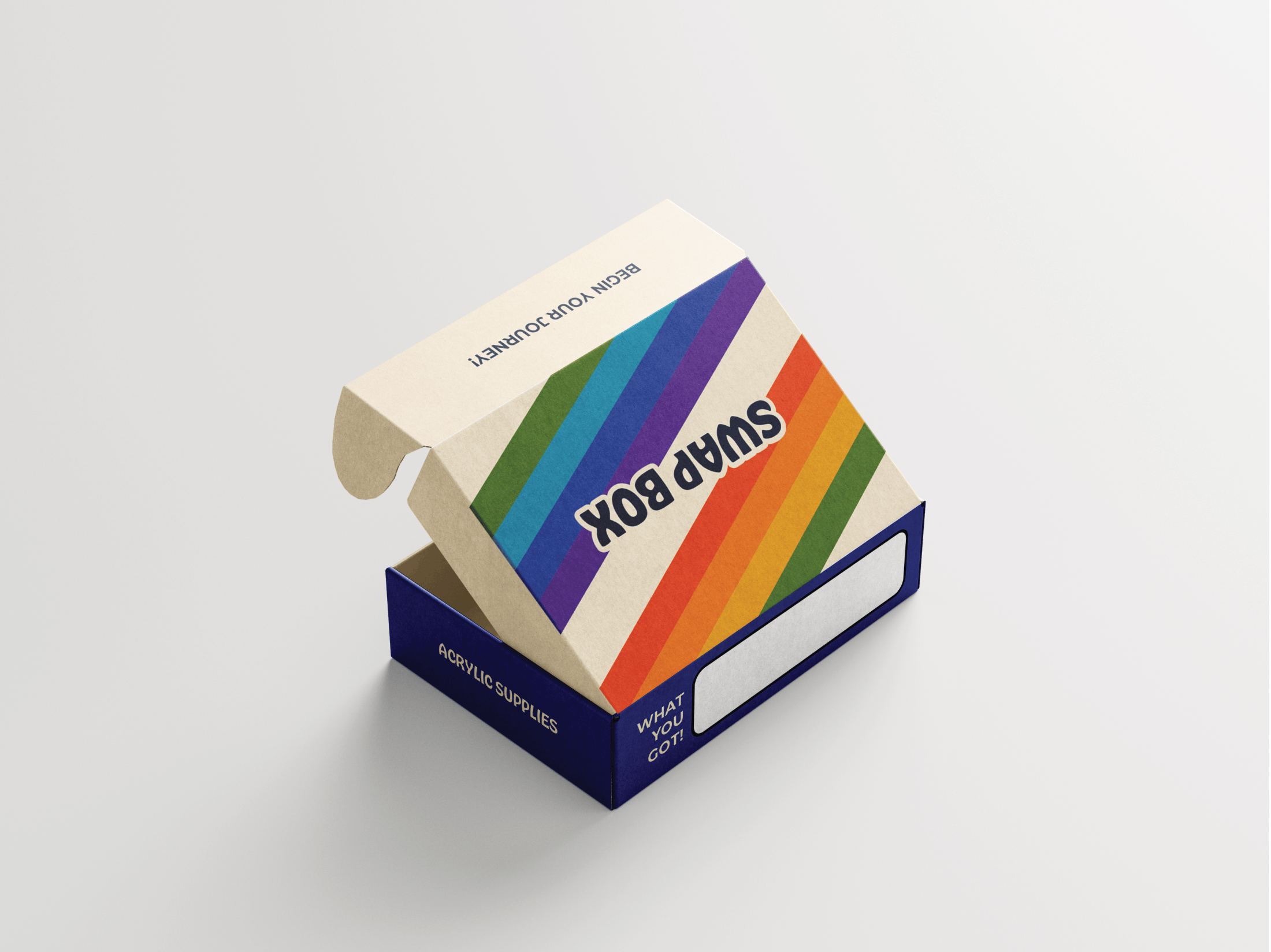
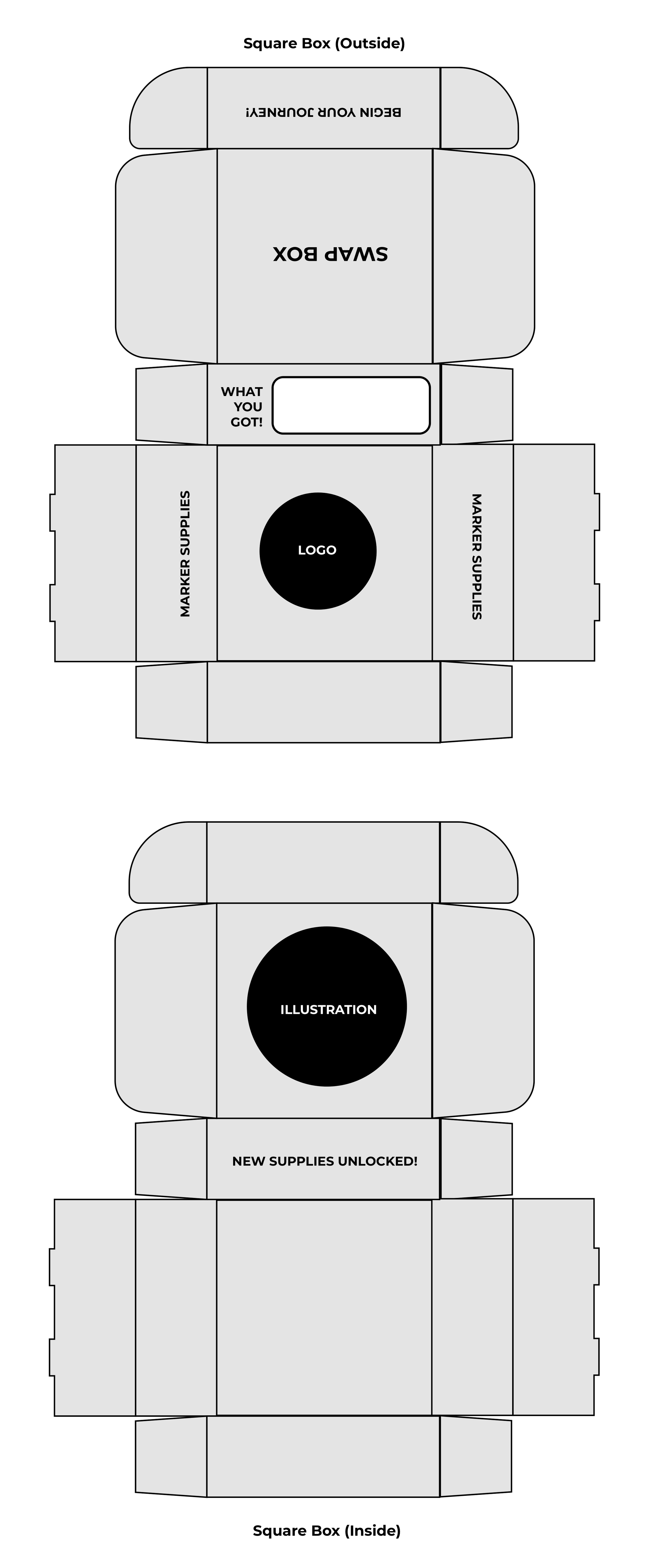
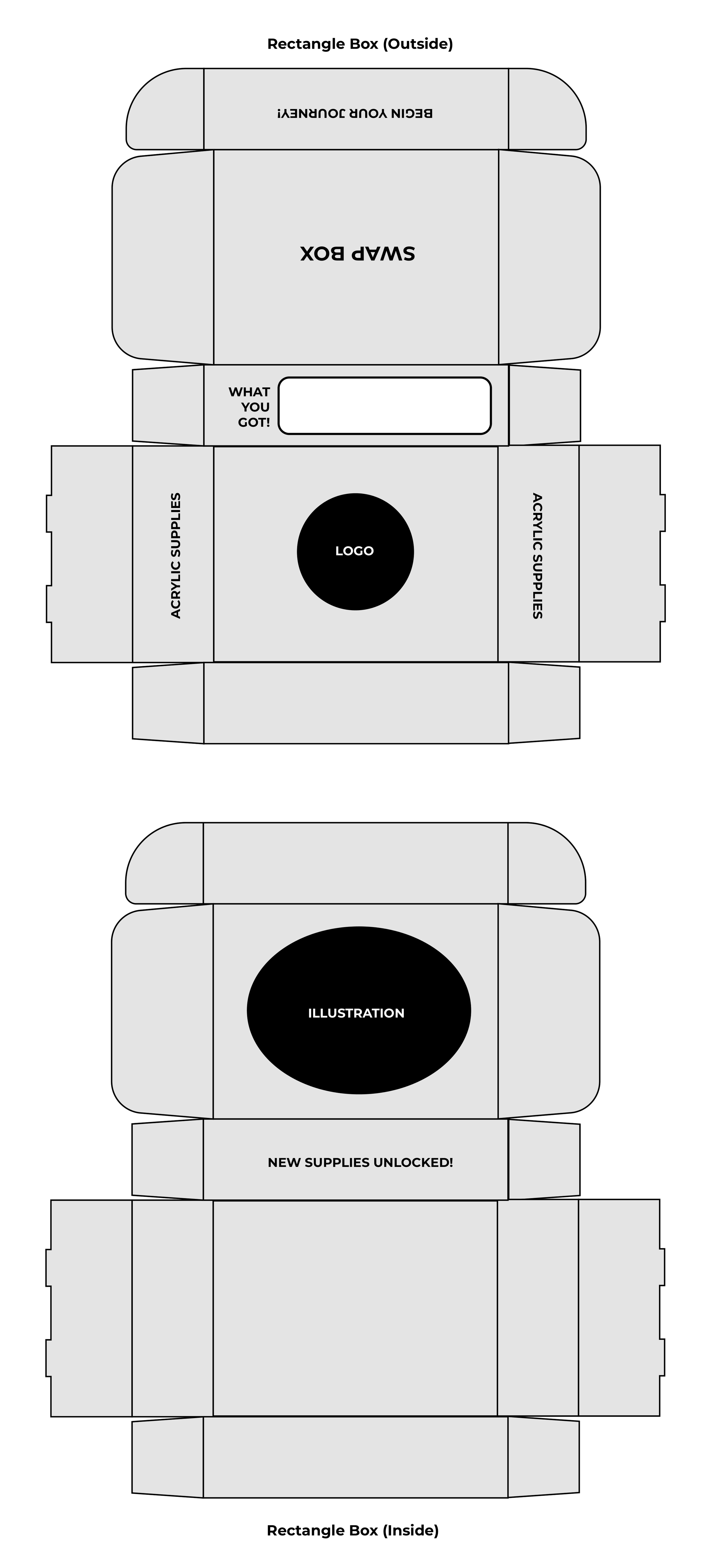
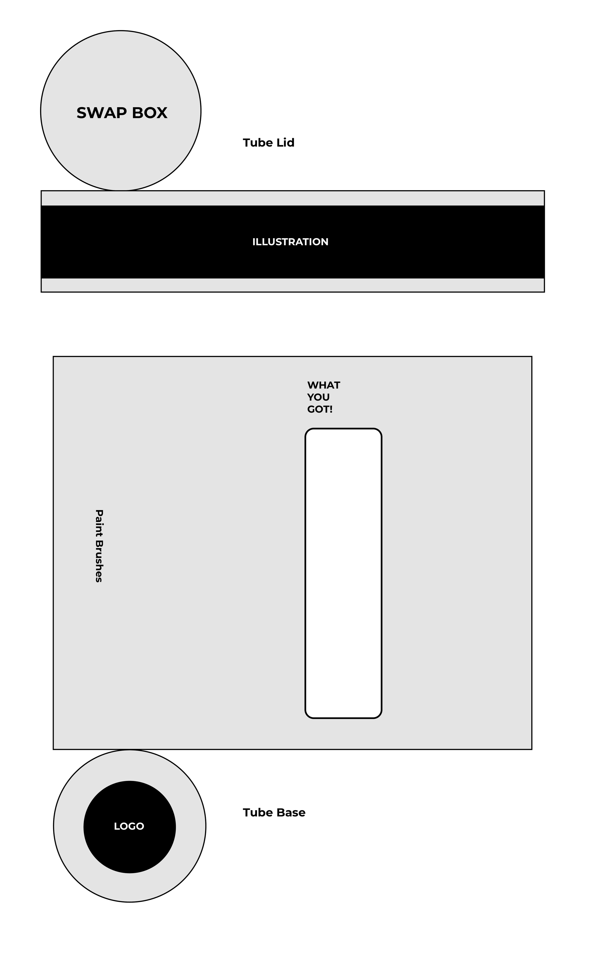
When developing the packaging, I tried to imagine what shapes would work best for different types of art supplies. I also made sure that besides just listing what type of materials are in each container, someone filling them would be able to label the packaging with a more specific itemized list.
When laying out the website, I wanted to make sure all of the resources were very prominent. I then wanted to make the purpose of my program clear by creating a mini "about us" section on the landing page. Lastly, I wanted to include community art to help show off the types of work we do and show that it's not that intimidating to start.
I also focused on building out the header and the information page to include all of the necessary touch points.
❋ Logo Evolution
Once I had the name, the design came quite naturally. The idea of a warehouse conjured the feelings of a small factory. To make this feel more artistic, I wanted to create a soft, splatter effect without picking a specific artistic medium. I choose to include leaves bursting out like paint. It also serves as a reminder of the growth and new beginnings welcome at our work spaces.

Drafts


Final Design
❋ User Feedback
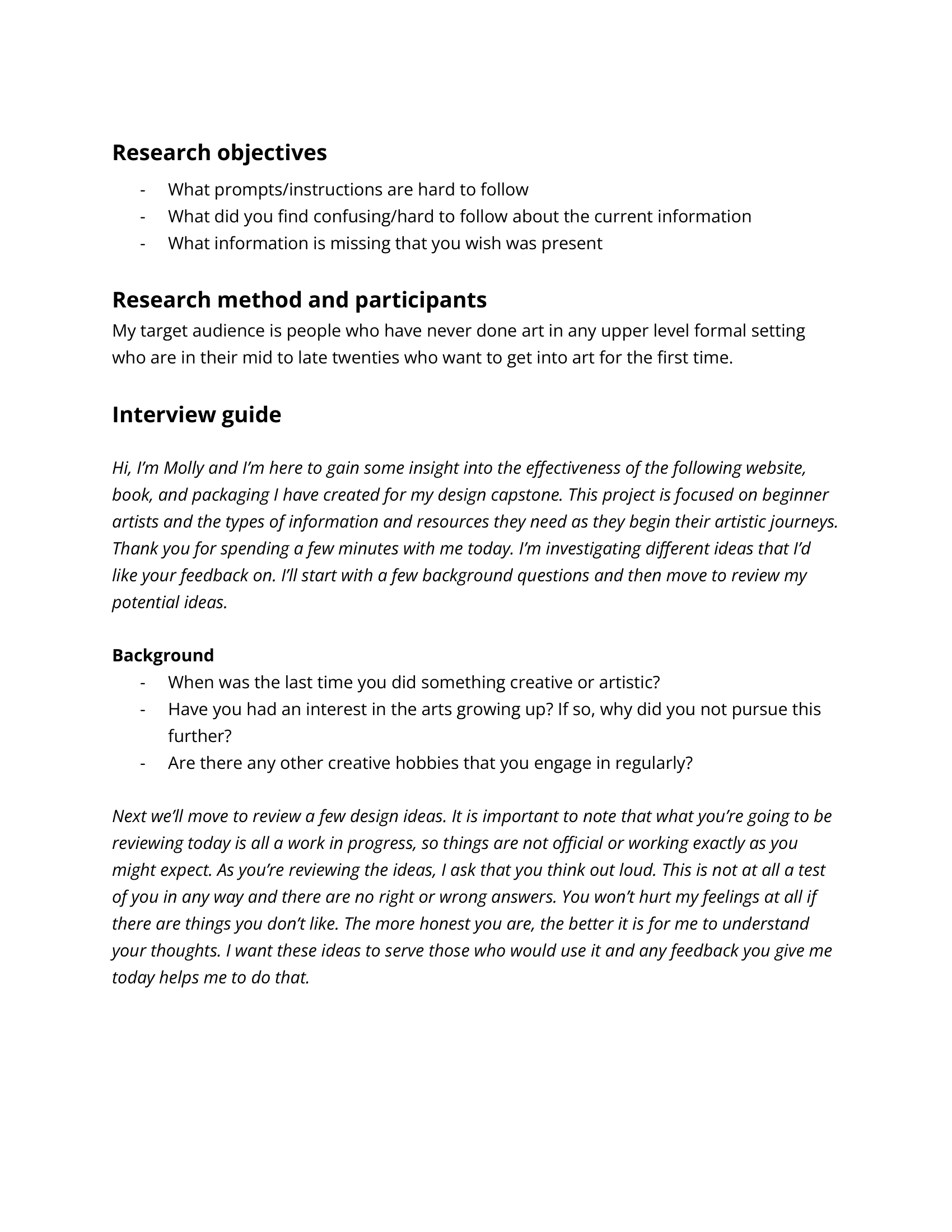
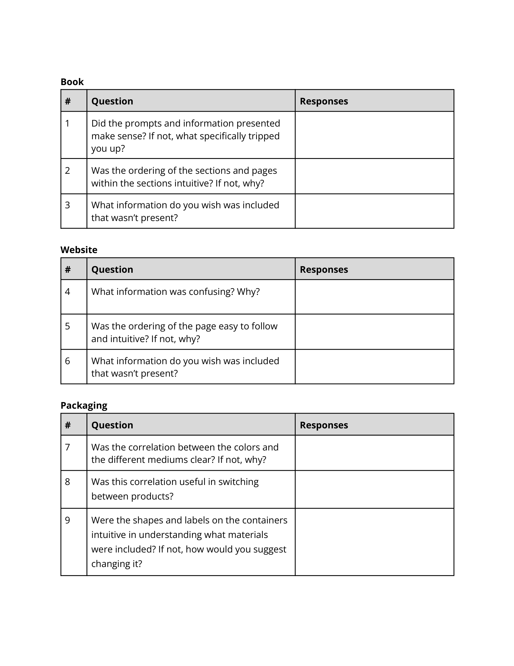
After drafting usable prototypes, I then began my user testing phase. This consisted of 5 main interviews with people within the target audience and one with another artist in which they all tested the physical designs I created and gave verbal feedback to me throughout the process. This lead me to sort their individual feedback into 5 main takeaways.
Accessibility and Providing the Correct Amount of Information
Need to provide enough information to break past initial fear barriers.
Swap Box feels like a good idea for supporting the promise of accessibility.
For the Swap Boxes, more information should be provided with each box to give instructions for the beginners.
Including maybe a shortened portion of the corresponding chapter to help remedy
this (Opt in to receiving pamphlet).
Ordering of the Book
Confusing levels of difficulty, do they correspond to the order of the books chapters.
The order of the book pages is good within each chapter.
Leaving Room for Expansion
Use language that gets at a broad focus to allow for room to expand in the future.
On the website, use the crafting and more section as a way to allow for future expansion.
Defining/Simplifying Instructions and Techniques for Beginners
Simplify wording surrounding third party spaces.
Work to define all art tools. You have knowledge about this that beginners don't.
Define the different materials used more than just including a visual.
Create simpler and more informative prompts.
Don't assume all people know what the correct way to do something is.
Expand on how certain techniques are to be preformed with the materials.
Use of Color
Color coding is consistent and easy to follow.
Add more rainbows on the website!! Color is fun!
For the boxes, the correlation between the color is good, but more useful on the page advertising the product.
Design Enhancements
I plan to simplify a lot of language in the book. I went through section by section with an artist friend to find more understandable information that remains accurate.
I plan to change the word choice of some sections to make sure I am leaving room for the "expansion" of the company in the future to branch out into other areas of art.
I plan to add more color to the website and make sure that the use of color remains succinct for branding.
I plan to make sure the order of the book corresponds with a definitive piece of information (level of difficulty, dry to wet materials, etc.)
I will be adding text in the swap box and on the website that point to an additional pamphlet available with each box for more individualized instructions, maybe a flyer to purchase the book/QR to view it online (bottom of the box).
I will be mocking up the variety of page textures within the book to add depth and show the variety within the demo.
❋ Final Designs
Here are the final designs after the iterations rendered in full color. They display the full book, packaging, and website I designed, laying out the 3 main ways you can interact with the Creativity Warehouse